Powerful JavaScript Input Components
Wijmo's variety of Input components answer every application's need.
- Create and enter data quickly and efficiently using a mouse or touch
- Specialized and optimized for each data type
- Includes first-class Angular, React, and Vue support
Overview
JavaScript Input components are software elements used to create interactive controls for web-based forms to allow data collection from users.
DropDown Input Controls
DropDown
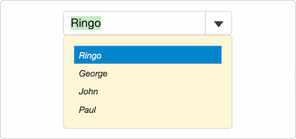
The DropDown component is an abstract class used as a base for several of Wijmo's input components. It is composed of the input element, the drop-down button, and the drop-down element.
ComboBox
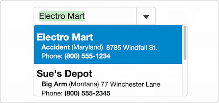
Wijmo's JavaScript ComboBox component allows users to select and edit both strings and objects from a list. It includes features such as Numbers and Dates support, multi-column dropdowns, and custom HTML content.
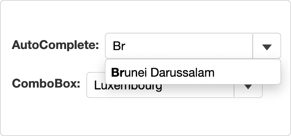
AutoComplete
Extend the functionality by automatically filtering items in the dropdown based on user input. Customize the search parameters, filter functionality, and integrate asynchronous loading when loading a large data set.
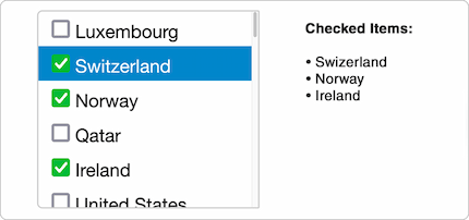
ListBox
Display a list of objects and is used as the drop-down for the ComboBox control. The ListBox allows you to customize the cells using HTML and add checkboxes to each list item and track which items are checked.
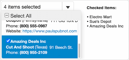
MultiSelect
Extend the ComboBox control and adds checkboxes to each item in a drop-down list. Set which items are checked based on property inside your objects and customize the cells of the MultiSelect control by setting custom HTML.
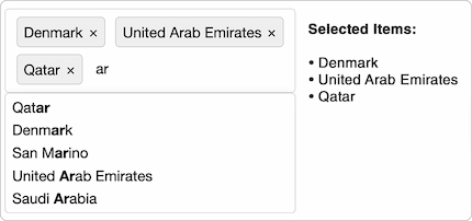
MultiSelectAutoComplete
Wijmo's MultiSelectAutoComplete control allows users to select multiple items from the control's data set. The control displays a drop-down that matches the control's current input and displays the currently selected items.
DateTime Input Controls
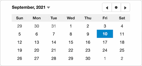
Calendar
Set date ranges that users can pick from, validate user selection, and customize each date cell within the calendar.
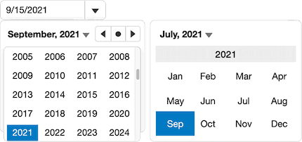
InputDate
Select a date by either entering a date value into the drop-down control or expending it and selecting it from the Calendar control.
Try the InputDate Demo
Read More
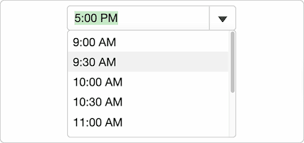
InputTime
Wijmo's InputTime control extends the ComboBox class to allow easy entry and editing of time values.
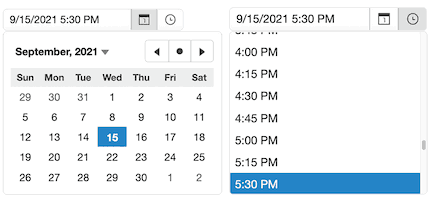
InputDateTime
Wijmo's JavaScript InputDateTime control extends the InputDate control, allowing users to select from a range of times as well as dates. Users can either enter the date and time into the input element or expand the drop-down and select values from the drop-down lists.
InputDateRange
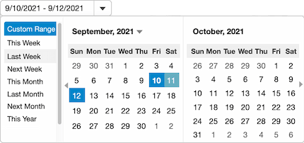
The InputDateRange control extends Wijmo's InputDate control and configures it to allow editing date ranges. You can specify custom date ranges that users can pick from, or they can use the multi-month calendar in the drop-down to select date ranges with the mouse or keyboard.
Numeric Input Controls
InputNumber
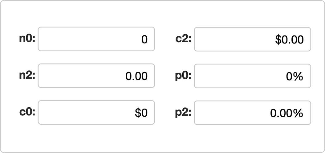
The InputNumber control is an input control that allows users to enter and edit numbers. It allows you to format the number, set a step value for incrementing/decrementing the value in the control, and set a minimum and maximum range for values that can be entered.
InputMask
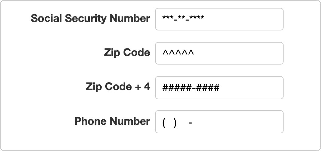
Validate and format the user input as it is entered, preventing users from entering the invalid date. Set prompt characters, such as asterisks to represent a social security number, and retrieve the raw data, stripped of the prompt characters.
Color Selector Input Controls
InputColor
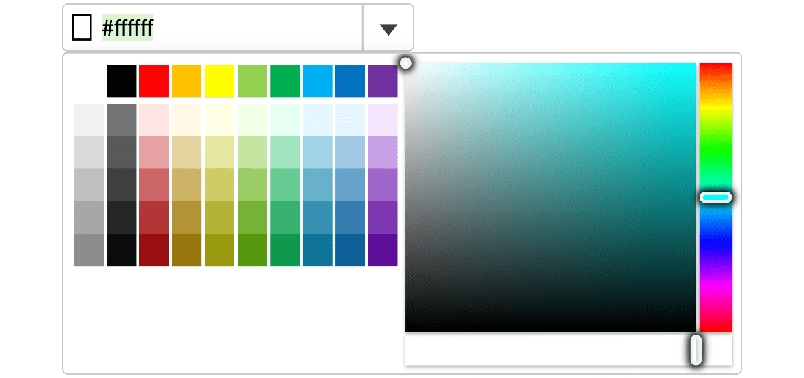
Wijmo's JavaScript InputColor component extends the ColorPicker control, placing it in a drop-down component. This allows users to select a color by either entering the hexadecimal color value in the drop-down.
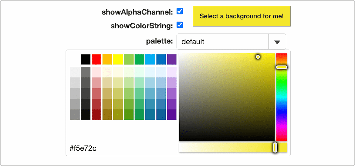
ColorPicker
Wijmo's ColorPicker control is a panel that allows users to select a color. The ColorPicker can be customized to display the hexadecimal value, show the alpha channel, and change the palette that is shown to the user.
Featured Blogs, Videos, and Other Resources
Trusted by the World's Leading Companies

