Calendar for JavaScript
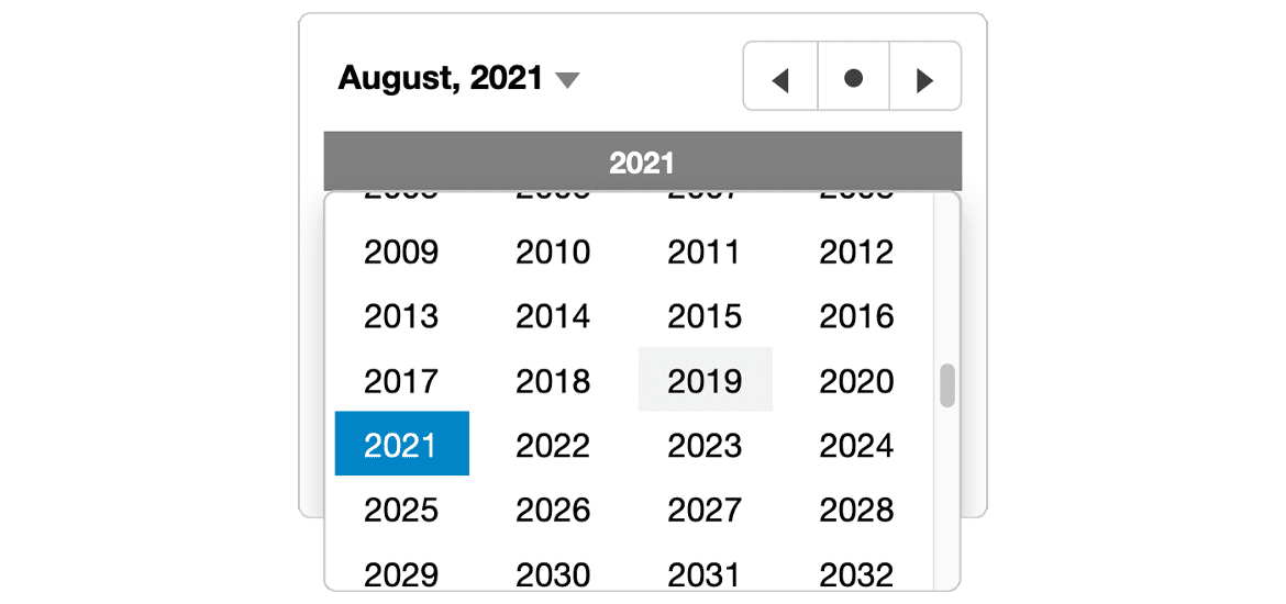
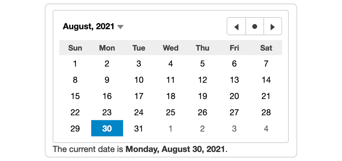
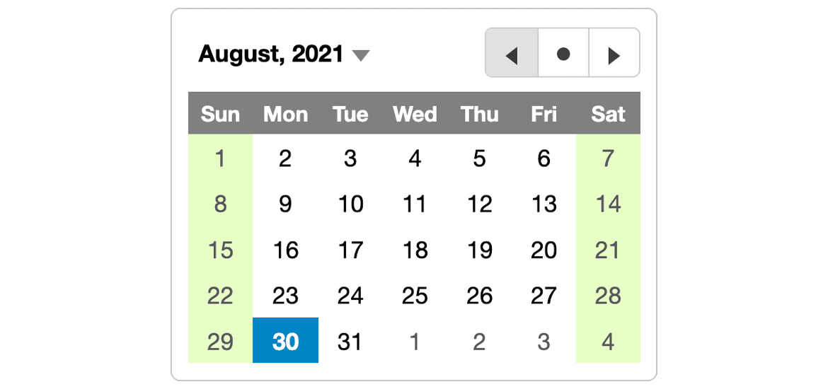
The calendar control displays a one-month calendar by default. It allows users to select any date by day, month, or year. The selectionMode can switch between day or month by clicking the "MM, YYYY" in the upper left.
User Selection
The value property gets or sets the currently selected date. The min and max properties restrict the range of dates that the user can select. Or, use the selectionMode property to determine whether users should be allowed to select days, months, or no values at all.
Calendar Ranges
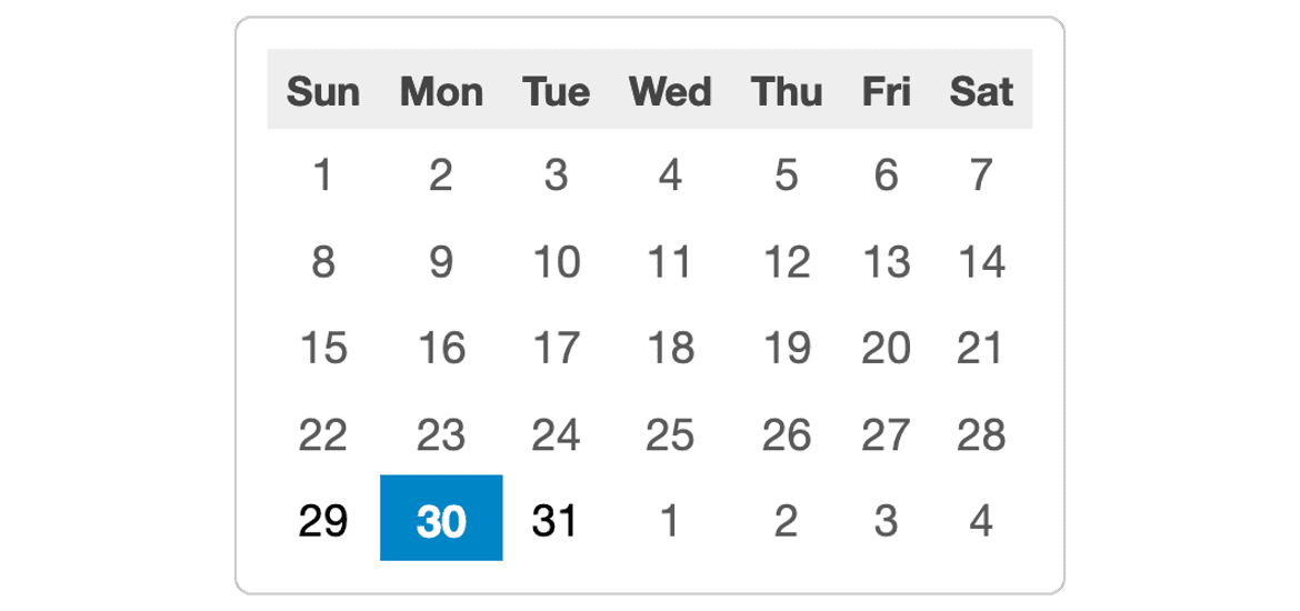
Use the Calendar's min and max properties to restrict the range of dates that can be entered.
Customization
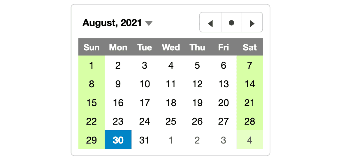
Customize the appearance of the whole calendar using CSS, and use the calendar's formatItem event to customize the appearance of specific dates.
Validation
The Calendar component prevents users from selecting values outside the range determined by the min and max properties.
To handle invalid input, the Calendar component has an itemValidator property. This property represents a function that takes a date as a parameter and returns true if the date is valid for selection, or false otherwise.
Year Picker
Click on the year header to open a handy year picker allowing you to jump across years in the Calendar component.
