TabPanel for JavaScript
The TabPanel enables content organization at a high level, such as switching between views, data sets, or functional aspects of an application. Tabs are presented as a single row above their associated content, and tab headers succinctly describe the content within the cell.
Switch Between Content Views
Easily switch between views or content in your app with the JavaScript TabPanel. Integrate this component with a simple unordered list and expand your app's design possibilities.
Features include:
- Auto-refreshing when switching tabs
- Add tabs programmatically
- Detachable panels
- WAI-ARIA accessibility
- Right-to-left orientation
Host Wijmo Components in the Panels
Any Wijmo component, like FlexGrid, FlexChart, or Gauges, can be added to the panels and automatically refreshed on click.
Extend the TabPanel to Create a JavaScript Ribbon
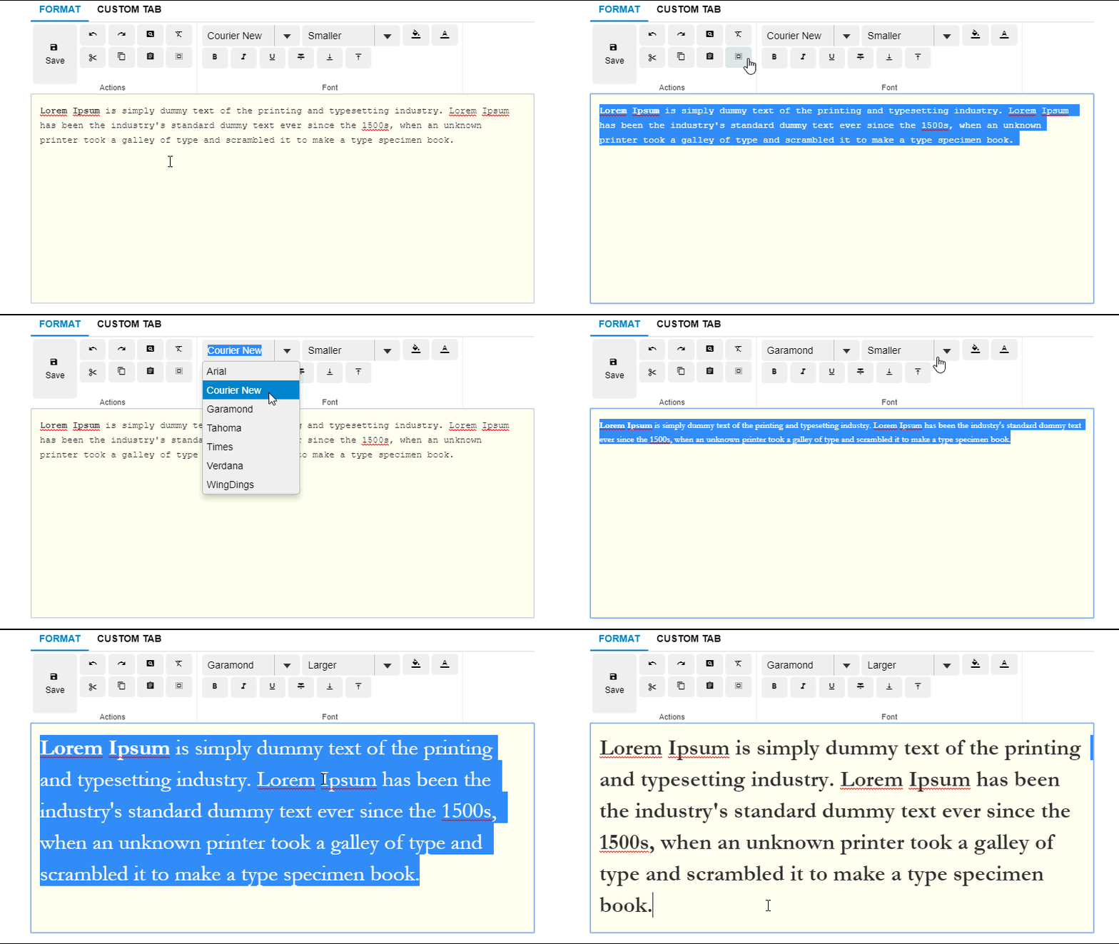
The Ribbon sample extends TabPanel to create a familiar, intuitive navigation experience for users. The tab pages contain groups of components arranged in rows and columns. Components in the groups use Material Icons, and have tooltips created automatically based on the aria-label attribute assigned to each component.
Customize TabPanel With CSS
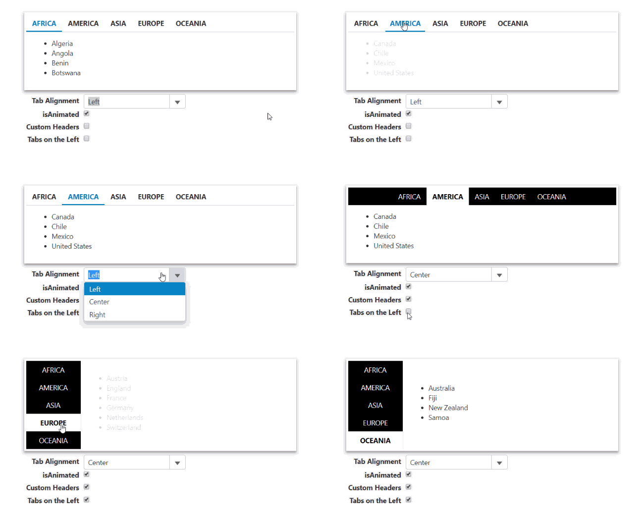
Using basic CSS and TabPanel's simple layout, you can edit the tabs' alignment, animation, and style.
Disable and Hide Tabs
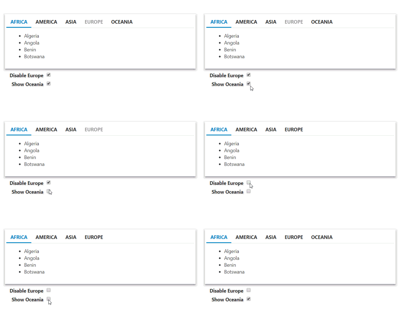
Disable or hide individual tabs using the Tab's isDisabled and isVisible properties.


