Custom Cells for Angular Datagrids
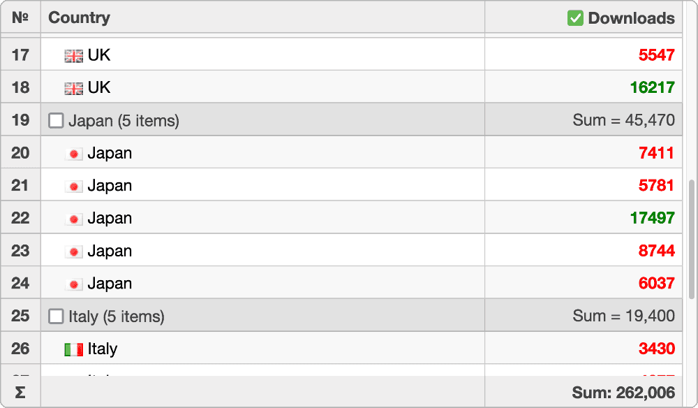
Wijmo's Angular datagrid, FlexGrid, allows you to heavily customize the look, feel, and functionality of every cell within the datagrid. You're able to add both Wijmo and custom components to cells, conditionally style cells and the data within, and dynamically update cells within the datagrid.
Cell Templates
FlexGrid allows you to define custom content in the datagrid's cells by using template markup. Use this to add images and Angular components to cells, as well as customize cells based on their contents.
Cell Maker
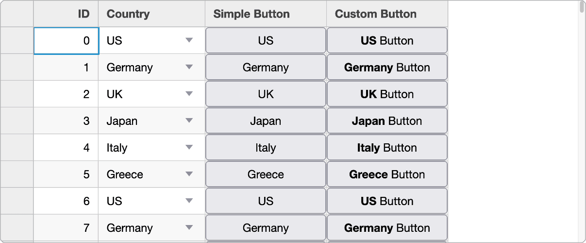
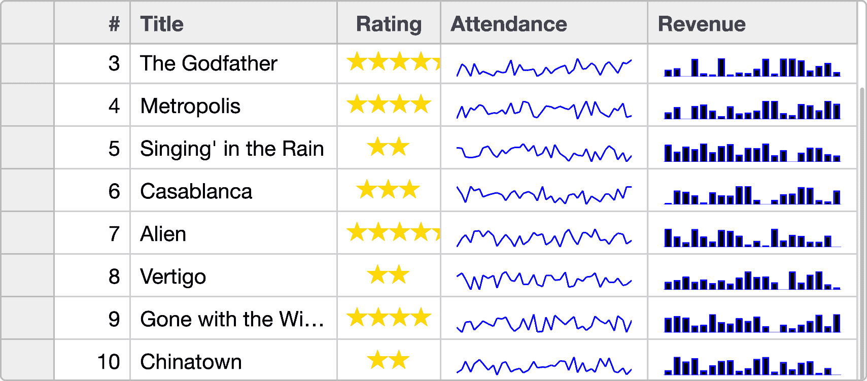
FlexGrid's CellMaker Angular class provides a simple way to create common types of custom cells. You can convert the datagrid's cells into buttons, hyperlinks, drop-downs, images, ratings, and sparklines.
Dynamic Updates
By default, FlexGrid updates all cells automatically when there are changes in the data source. If there are frequently updated items in the data source, FlexGrid limits updating to only bound items that have actually changed. This prevents the datagrid from updating every cell and increases performance.
Conditional Formatting
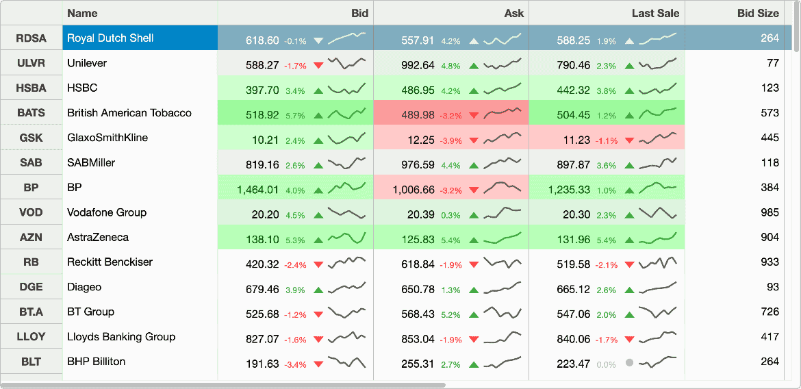
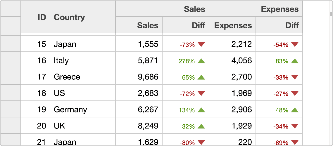
Customize and style cells based on data value by using FlexGrid's formatItem event. This enables you to access the contents of each cell as they are rendered in the datagrid–allowing you to customize each cell to meet your needs.
Sparklines
In addition to custom controls and conditional styling, FlexGrid also supports the implementation of sparklines within cells. Sparklines allow you to show visual representations of data within the cells of the Angular datagrid.
