JavaScript Spreadsheet Charts and Data Visualization with SpreadJS Charts
Overview
SpreadJS provides many options to help you better visualize your data using charts. SpreadJS offers the highest level of compatibility with Excel Charts on the market, making it easy to import or export any Excel files that may contain charts. With extensive support for eleven chart groups, thirty-three chart types, trendlines, and combo chart ability, you can insert any two-dimensional charts in your spreadsheets. Set custom chart layouts, customize chart elements as per your preferences, and combine multiple chart types to evaluate financial information, perform stock analysis, present sales revenues, and much more.
Column Charts
A column chart represents data in vertical bars across the plot area on a horizontal axis. This type of chart is ideal for performing comparisons and analysis between two or more categories of data.
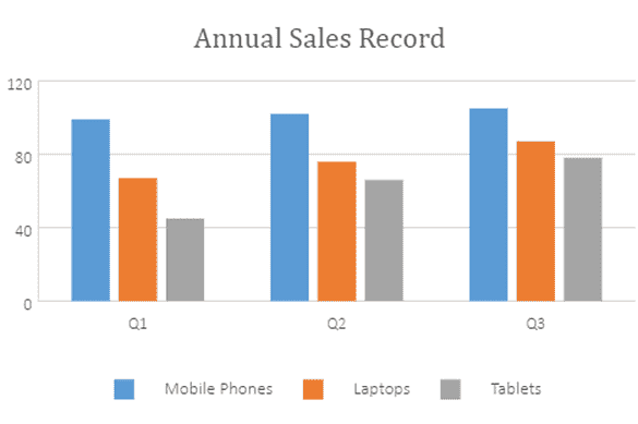
Clustered Column Chart
Clustered Column Chart allows you to plot multiple series in a single chart to compare different data sets. You can enable a legend and tooltip, which gives more information about the individual series.
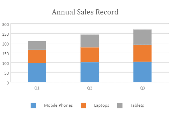
Stacked Column Chart
Stacked Column Charts are charts with X values stacked over one another in the series order. Shows the relation between individual values to the total sum of the points.
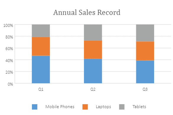
100% Stacked Column Chart
100% Stacked Column Charts are charts with X values stacked over one another in the series order. Shows the relation between individual values to the whole, which is out of 100%.
Line Charts
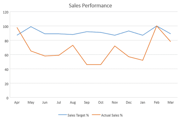
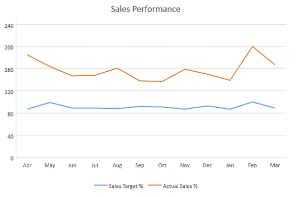
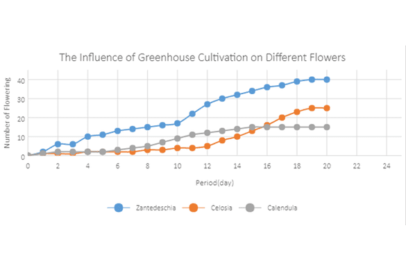
A line chart can help users visualize continuous data over time on an evenly scaled axis. These charts are ideal for analyzing trends in data at equal time intervals, like months, quarters, or fiscal years.
Line Chart
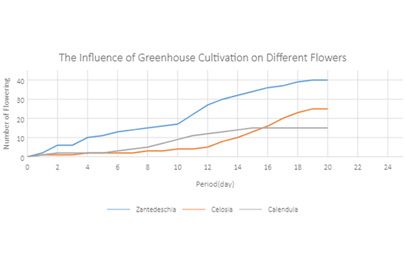
Line Charts represent and visualize the time-dependent data to show the trends at equal intervals.
Stacked Line Chart
Allows you to plot multiple series in a single chart to compare different data sets. You can enable a legend and tooltip, which gives more information about the individual series.
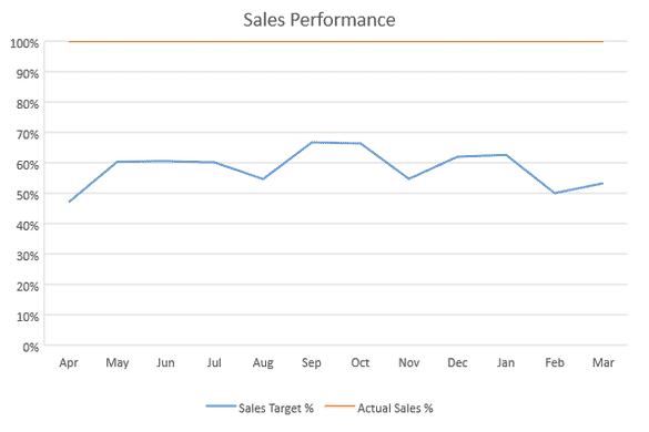
100% Stacked Column Chart
Allows you to plot multiple series in a single chart to compare different data sets. Shows the relation between individual values to the whole, which is out of 100%.
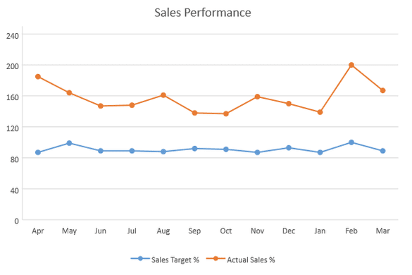
Line with Markers
Allows you to plot multiple series in a single chart to compare different data sets. Shows the relation between individual values to the whole, which is out of 100%.
Stacked Line with Markers
Allows you to plot multiple series in a single chart to compare different data sets. Data markers are used to provide information about the data point to the user.
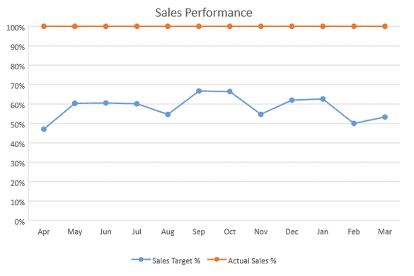
100% Stacked Line with Markers
Allows you to plot multiple series in a single chart to compare different data sets. Shows the relation between individual values to the whole, which is out of 100%. Data markers are used to provide information about the data point to the user.
Area Charts
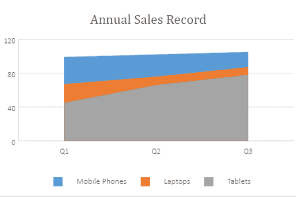
An area chart extensively displays the contribution of each data value over time. Typically, this chart is ideal when you need to show the plot change over time and depict the total value across a trend by showing the sum of the plotted values.
Area Chart
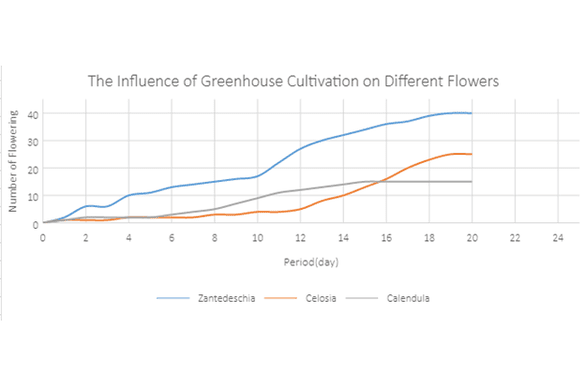
Area Charts is like a Line Chart to represent time-dependent data and to show the trends at equal intervals, but it fills the area below the line. Uses numeric, category, datetime, or logarithmic axis to plot data.
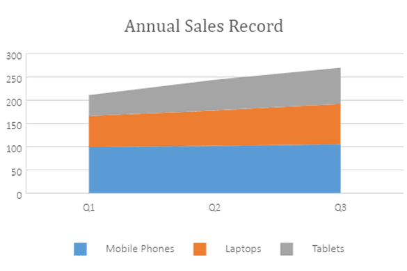
Stacked Area Chart
Stacked area charts are charts with Y values stacked over one another in the series order. These charts show the relation between individual values to the total sum of the points.
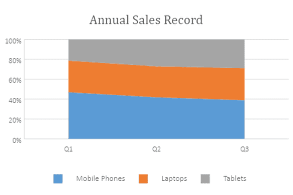
100% Stacked Area Chart
The 100% stacked area chart displays multiple series of data as stacked areas, ensuring that the cumulative proportion of each stacked element always totals 100%. The y-axis will hence always be rendered with the range 0–100.
Bar Charts
A bar chart extensively used to illustrate comparisons between individual items or categories.
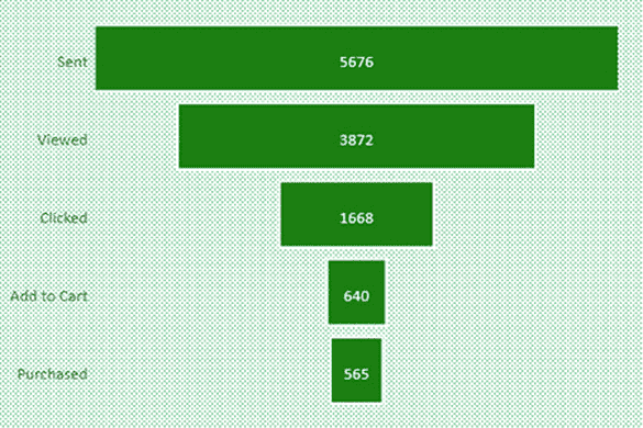
Funnel Chart
These types of charts are best used to represent stages in a sales process to show the amount of potential revenue in each stage. You could also show a flow of users through an email campaign starting with emails sent out, then how many of those were viewed, clicked, etc., with values typically decreasing at each level, resembling a funnel.
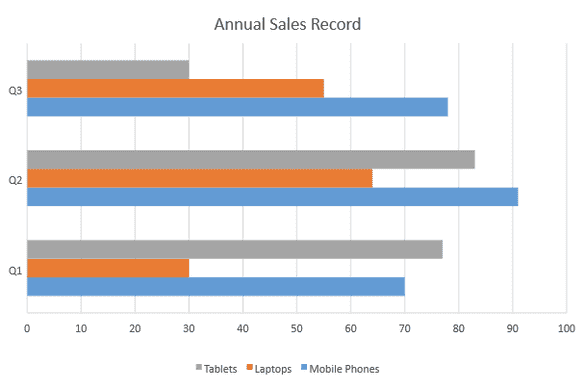
Clustered Bar Chart
Data that's arranged in columns or rows on a worksheet can be plotted in a bar chart. Bar charts illustrate comparisons among individual items. The categories are typically organized along the vertical axis and the values along the horizontal axis.
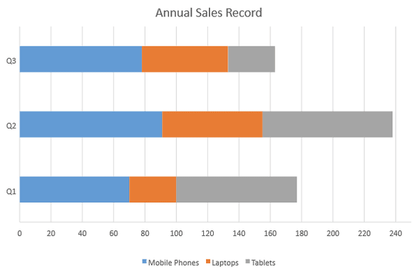
Stacked Bar Chart
Stacked Bar Chart uses bars to show comparisons between categories of data, but with the ability to break down and compare parts of a whole. Each bar in the chart represents a whole, and segments in the bar represent different parts or categories of that whole.
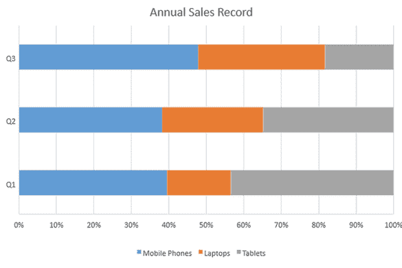
100% Stacked Bar Chart
100% Stacked Bar Chart uses bars to show comparisons between categories of data, but with the ability to break down and compare parts represented as percentages of 100%. Each bar in the chart represents a whole, or a full 100%, and segments in the bar represent different parts or categories of that whole.
Scatter Charts
A scatter chart illustrates relationships between individual items or categories. This chart is ideal for showing comparisons for scientific, statistical, and engineering data.
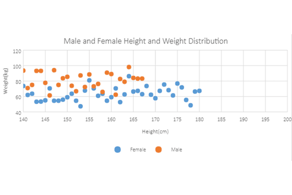
Scatter Chart
Scatter Charts are used to plot data with two numeric parameters. Scatter charts are used to find out if there's a relationship between the x and y variables.
Scatter with Smooth Lines and Markers
The Smooth Lines are used to help visualize continuous data over time and the Data Markers are used to provide information about the data point to the user.
Scatter with Smooth Lines
This line displays the non-random component of the association between the variables. Smoothing attempts to separate the non-random behavior in the data from the random fluctuations, removing or reducing these fluctuations, and allows prediction of the response based value.
Scatter with Straight Lines and Markers
The Straight Lines are used to help visualize continuous data over time and the Data Markers are used to provide information about the data point to the user.
Scatter with Straight Lines
This line displays the non-random component of the association between the variables. Straight Lines help determine the trend between the two graphed variables.
Bubble Chart
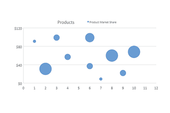
Bubble Charts allow you to visualize data in 3 dimensions. The size of the bubble is determined based on the third parameter.
Radar Charts
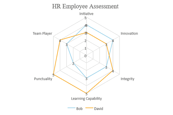
A Radar chart (also referred to as spider chart) is a two-dimensional chart that can be used to represent multivariate data plotted in rows and columns in the graphical format.
Basic Radar Chart
Radar Charts are for variables that show three or more dimensions. They can display the weight of each variable in the data set in a clear and visual way.
Filled Radar Chart
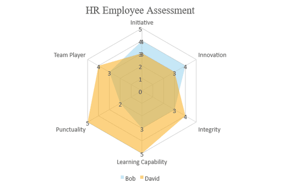
Similar to normal Radar Charts, Filled Radar Charts have an opaque fill to better visualize the data comparison and help highlight strengths as well as weaknesses.
Radar Chart with Markers
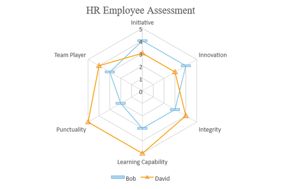
Similar to normal Radar Charts as well, but Radar Charts with Markers have customizable endpoints at each vector to help highlight the visual comparison between several quantitative or qualitative aspects of a situation.
Pie Charts
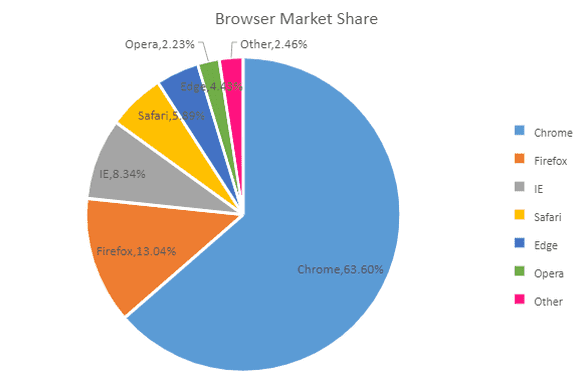
A pie chart displays the size of each item in a single data series in proportion to a total quantity. Data points show as a percentage of the whole pie. This chart is ideal when you want to visualize data in terms of percentage or share.
Doughnut Chart
Similar to Pie Charts, except for the space at the center, The Doughnut Chart is useful when you want to compare the contribution of each data with the total.
Stock Charts
A stock chart illustrates data range points during a period of time, such as daily stock prices or weather reports of daily rainfall or temperatures. Typically, this chart is ideal for analyzing financial data and visualizing stock information.
High-Low-Close
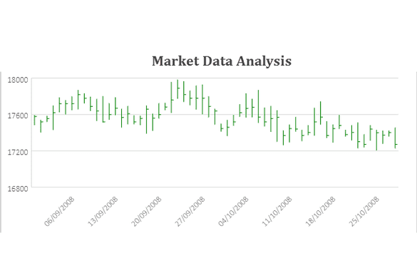
High-Low-Close Chart is used to illustrate the movement of price over a time period. A vertical line shows the Highest and Lowest values. Closing values are represented by Tick Marks.
Open-High-Low-Close
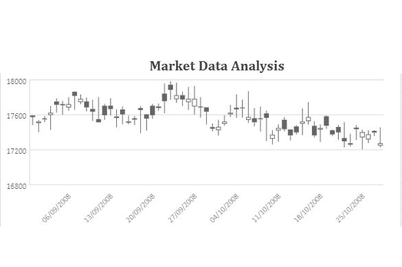
Open-High-Low-Close Chart is used to illustrate the movement of price over a time period. A vertical line shows the Highest and Lowest values. Opening and Closing values are represented by Tick Marks, to the left and right respectively.
Volume-High-Low-Close
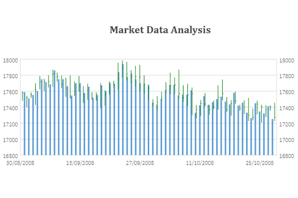
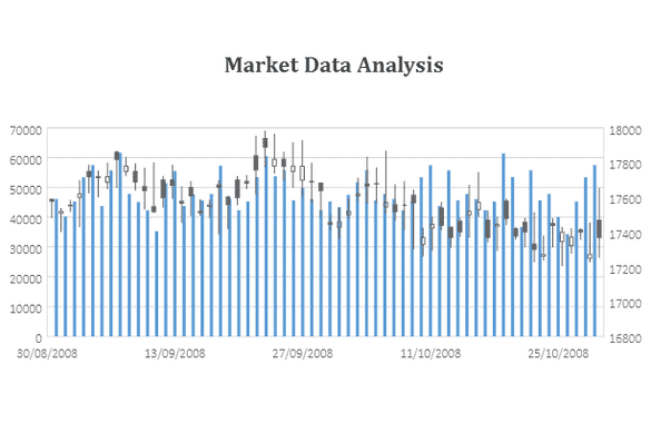
The Volume-High-Low-Close Chart shows volume on the primary axis, with a secondary axis that shows High-Low-Close chart.
Volume-Open-High-Low-Close
Volume-Open-High-Low-Close Chart is used to illustrate the movement of Volume over a time period. A vertical line shows the Highest and Lowest values. Opening and Closing values are represented by Tick Marks, to the left and right respectively.
Specialty Charts
Treemap Chart
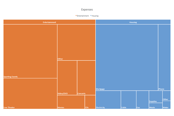
A treemap chart is a chart that displays the hierarchical data as a set of nested rectangles organized in a tree-like structure in the worksheet. These rectangles can have different colors and sizes that correlate to the structure of the tree, showcasing how the various items related to the whole in the hierarchy. Useful for showing the amount of stock in a store's inventory or the organization of employees in a company.
Sunburst Chart
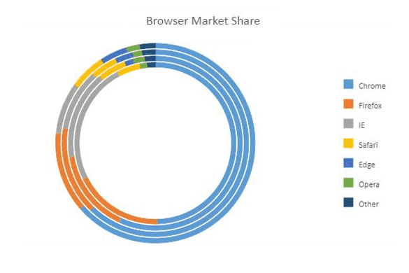
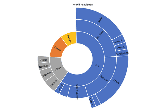
The sunburst chart is ideal for displaying hierarchical data. Each level of the hierarchy is represented by one ring or circle with the innermost circle as the top of the hierarchy. A sunburst chart without any hierarchical data (one level of categories), looks similar to a doughnut chart. However, a sunburst chart with multiple levels of categories shows how the outer rings relate to the inner rings. The sunburst chart is most effective at showing how one ring is broken into its contributing pieces.
Combo Chart
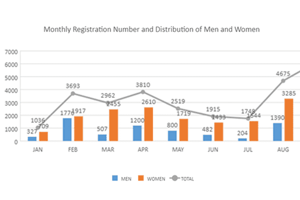
A combo chart combines two or more chart types in a single chart, making it easier for users to interpret and understand data. This chart is ideal when you want to visualize the different types of data that are entirely unrelated (for instance, price and volume) or when you need to plot one or more data series on the secondary axis.
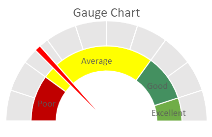
Gauge Chart
Gauge charts are a type of chart that combines elements of pie and doughnut charts into a single chart type. They are ideal for visualizing a single value in a quantitative way, making it easier to track progress and understand trends. Gauge charts are commonly used in dashboards, reports, and other web applications where it is important to quickly and clearly convey information about a particular metric or data point.
Add Trendlines to Charts
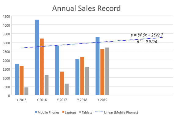
SpreadJS allows users to add trendlines to charts while visualizing data in the spreadsheets. A trendline, also called as a line of best fit, is an additional line in a chart that indicates the slope (trend) in a particular data series to help users in quickly analyzing the overall trend (even when there are ups and downs in your data points). Trendlines are supported on the following charts:
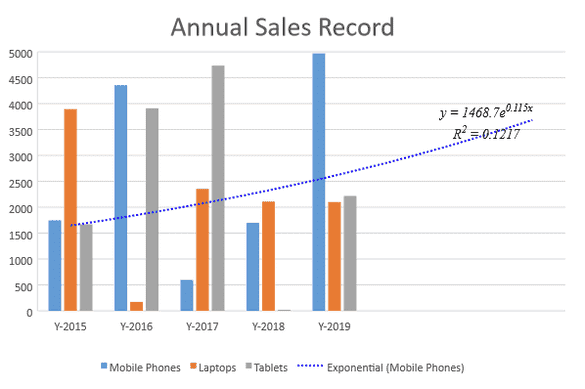
Exponential Trendline
This trend line is used when there is a constant increase or decrease in values.
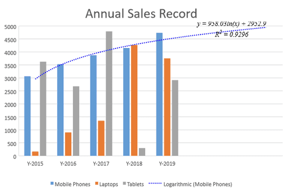
Logarithmic Trendline
This is used when there is a quick change in the data, either increasing or decreasing and then levels out.
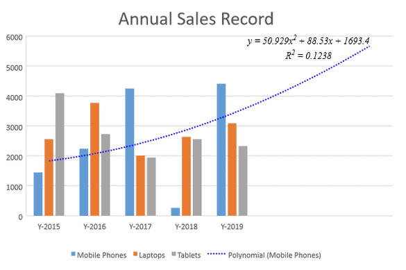
Polynomial Trendline
The polynomial trendline is a curved line that is used when there are more data fluctuations.
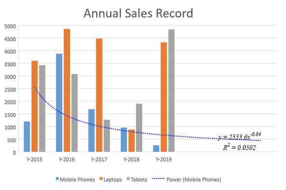
Power Trendline
This trend line is used for comparing multiple sets of data that increase at a specific rate.
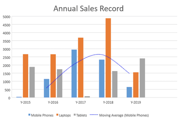
Moving Average Trendline
Use a Moving Average Trendline to help visualize trends about the future and the past.
Add Error Bars to Charts
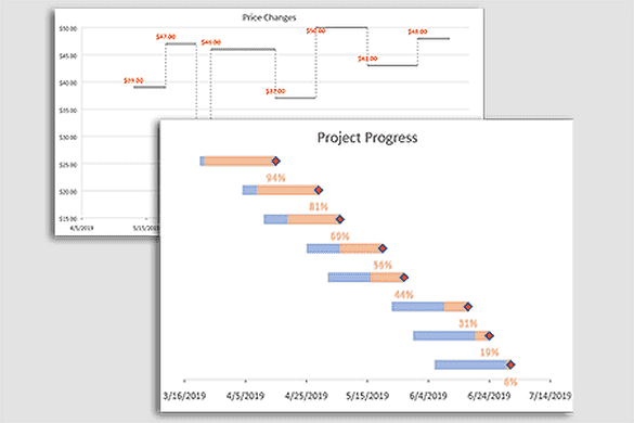
Error bars can help display margins of error and standard deviations in charts, but it has a few other uses as well, including step and Gantt charts. Error Bars support in the following charts:
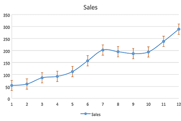
Standard Error Bars
Error Bars allow you to quickly display margins of error and standard deviations in your charts.
Custom Error Bars
Custom Error Bars allow you to highlight margins of error and standard deviations in your charts, however, you can customize the bars to represent specific data variability and measurement accuracy exactly how you want.
What's New in SpreadJS v16.2
SpreadJS v16.2 is available. This release offers several great new features, some of which include:
- GanttSheet Add-On Beta
- New Formula Editor Panel
- Framework Support for Angular 16
- Cross-Sheet Reference Support in FormulaTextBox
- New Cell defaultValue Property
- More Accessibility Options
- New Designer Buttons for Excel Themes, Colors, and Fonts
- Window Aggregation Function Added to the TableSheet
- And Much More!
