Fast, Flexible and Full-Featured WPF Datagrid Control
Display up to a billion data rows with FlexGrid, a powerful, high-performance WPF datagrid control.
- Get production-ready datagrid features such as sorting, filtering, and grouping
- Enhance your users' experience with enterprise features including data virtualization, sparklines and Microsoft Excel export
- Make the datagrid your own with customizable cell styles, filter menus, expanded row details and more
Overview
A WPF datagrid is a user interface control for displaying, editing, and analyzing large data sets. FlexGrid is a WPF datagrid optimized for high-performance and flexibility, enabling .NET developers to customize every aspect of the control.
Why Choose FlexGrid for WPF?
Familiar, Excel-Like Experience
FlexGrid delivers features similar to Microsoft Excel, such as keyboard navigation and selection, so it will be intuitive for your end-users.
MVVM Development Friendly
Define and data bind columns in XAML, following Model-View-ViewModel (MVVM) best practices, or code completely in C# or VB.NET.
Easy XAML Styling
All parts of the WPF datagrid control can be styled easily without having to customize complex XAML templates.
Great for Working With Large Data Sets
FlexGrid is designed for handling large data sets up to a billion rows with filtering, grouping, paging, and on-demand loading with virtual mode.
Best Performance in .NET 6
FlexGrid for WPF uses UI virtualization to overcome common performance bottlenecks. See our .NET 6 performance benchmarks for yourself.
More than Just a Datagrid
FlexGrid can be used as a tree grid with hierarchical views, nested grids and subtotals. Plus, FlexGrid has been extended to support pivot tables and Gantt views.
WPF Datagrid Key Features
Data Bound or Unbound
Get started quickly with automatic data binding to .NET data source objects or custom business objects. FlexGrid also supports an unbound mode, like a spreadsheet, giving you complete control over creating each row, column, and cell value.
Custom Cells
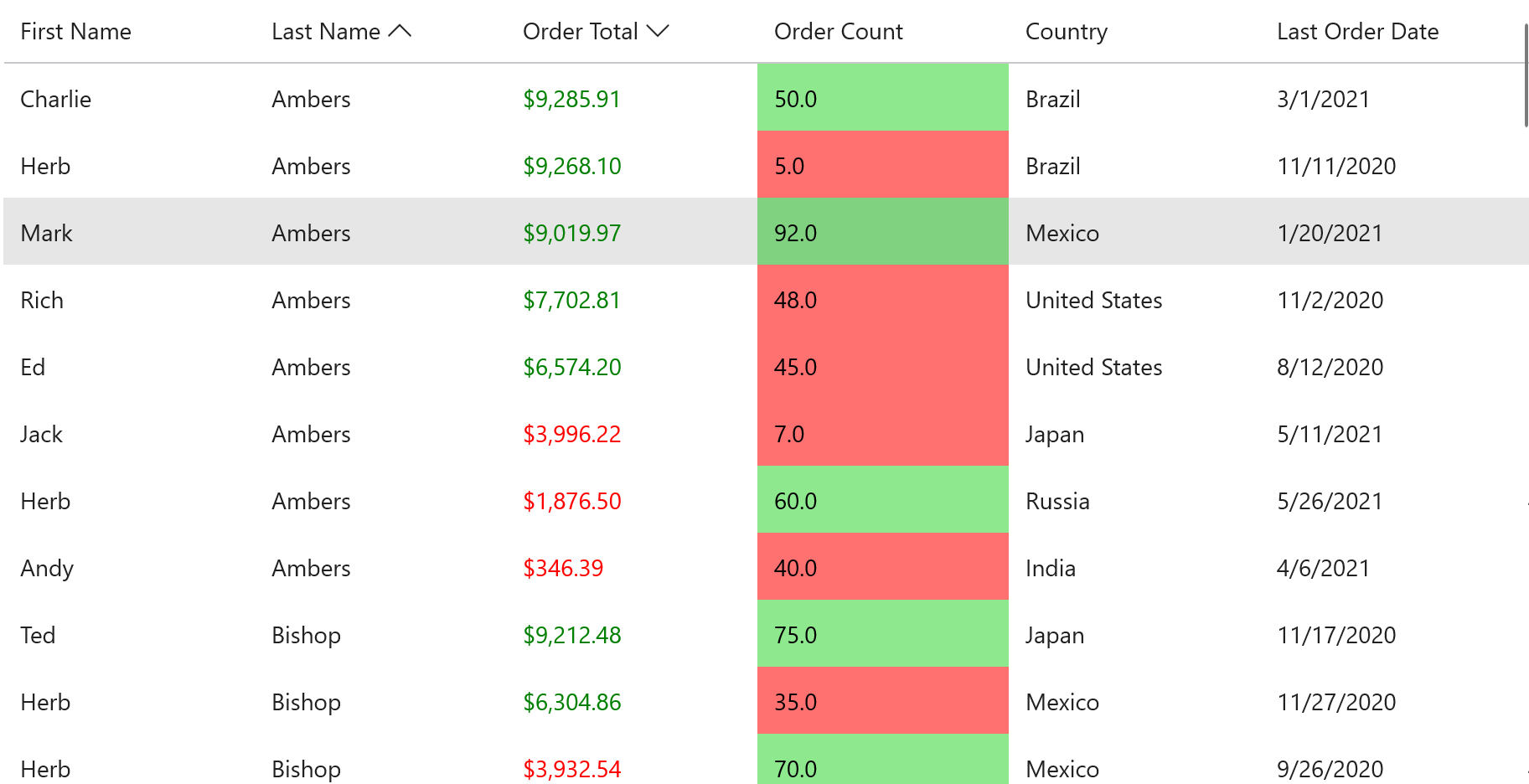
Conditional Formatting
Apply conditional formatting to highlight values that meet any criteria. FlexGrid provides a robust cell formatting API. Format cells in XAML templates or C# Cell Factories.
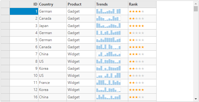
Custom Cells
One of the main strengths of FlexGrid is the ability to customize every aspect of the appearance of the entire grid and individual cells. Easily embed sparklines, images, ratings, or any UI element in the cells.
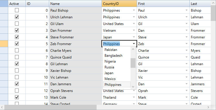
Cell Editors
FlexGrid provides several built-in editors to enable efficient in-cell editing for numbers, dates, checkboxes, and data-mapped combo-boxes. Or use any control to provide a custom editor.
Loading Large Data Sets
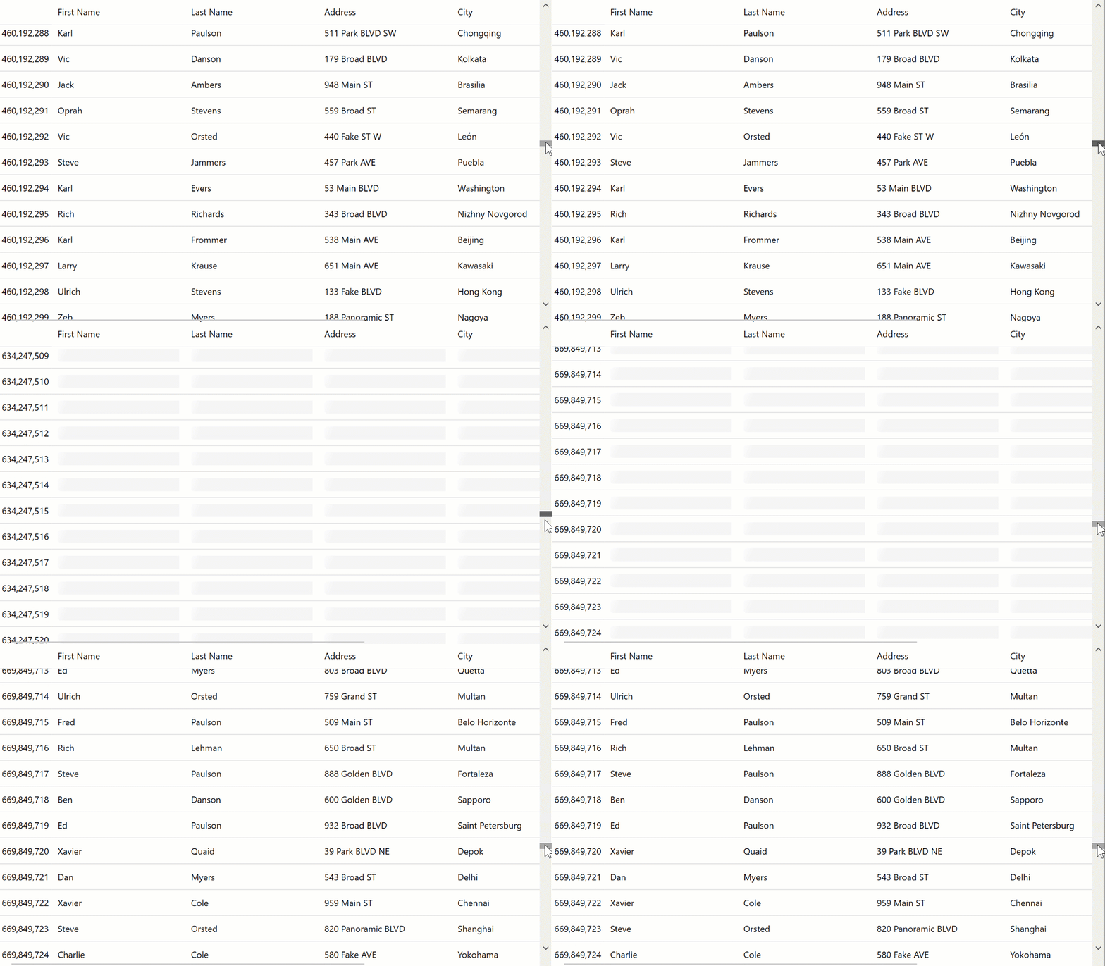
Virtual Mode and Skeleton Loading
Improve performance and reduce load times for very large data sets with on-demand loading, where data is only retrieved as the user scrolls. This feature is also known as "virtual mode" and is supported through the DataCollection component. FlexGrid also supports cell preview placeholders known as "skeleton" loading.
Paging
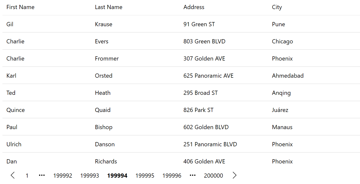
To improve performance you can enable paging rather than vertical scrolling. Set page length and scroll ahead or back to pages using the data pager control.
Filtering
Excel-like Filtering
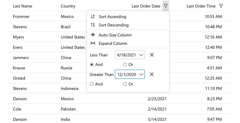
Enable filtering on any column's data by condition or value. FlexGrid supports drop-down filters in the column headers like Microsoft Excel with special filter editors for different data types.
Searching
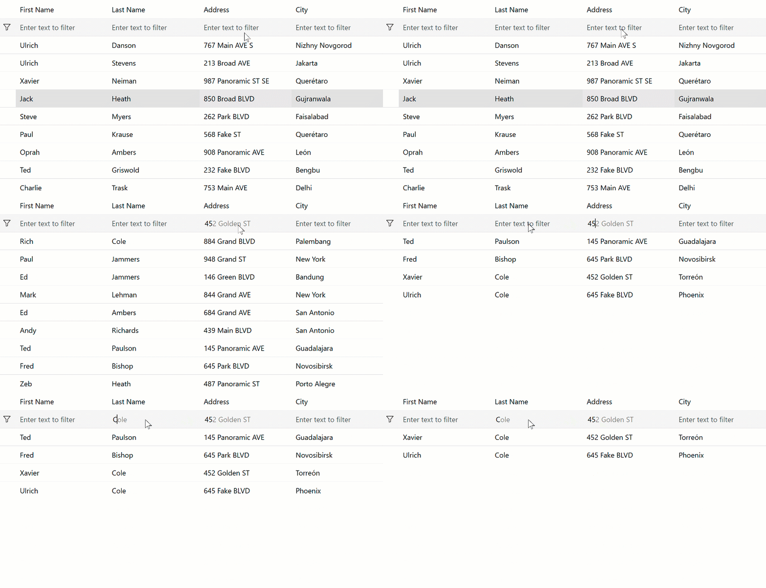
FlexGrid allows you to perform full-text filtering, or searches, on your data to show all matching instances found in the datagrid. Search the entire grid or just a specific column and then highlight all matching occurrences.
Advanced Filtering
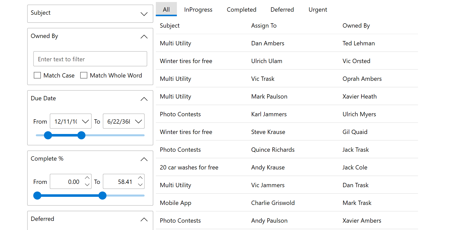
Enhance your WPF datagrid display with an advanced DataFilter UI. Provides E-commerce-like filters to your users so they may filter on the entire data set.
Column Features
Freezing and Pinning
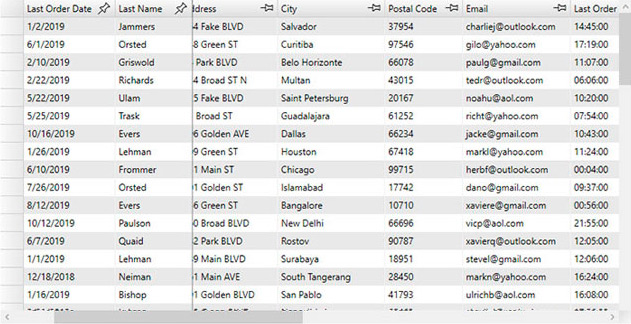
FlexGrid offers Excel-like row and column freezing and pinning. This allows users to keep rows and columns in view as they navigate the content of the WPF datagrid. Pinning allows any column to be frozen.
Adaptive Column Sizing
FlexGrid allows you to specify column sizing in code, as well as allow users to resize columns at runtime. Additionally, columns can be set to proportionally fill the space (also known as "star sizing"). This ensures the grid always fills the page and look great regardless of resolution.
Hierarchical WPF Datagrid
Grouping and Aggregation
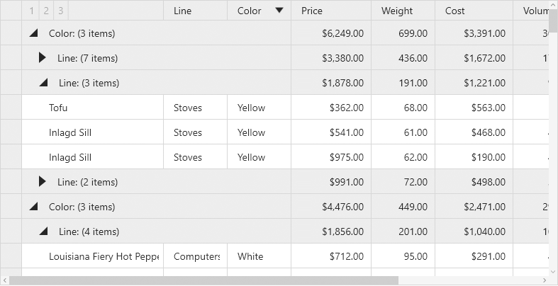
Enable runtime data grouping to help analyze large data sets. Users may group a column through the column menu. Display aggregated totals within a customizable group header.
Detail Row
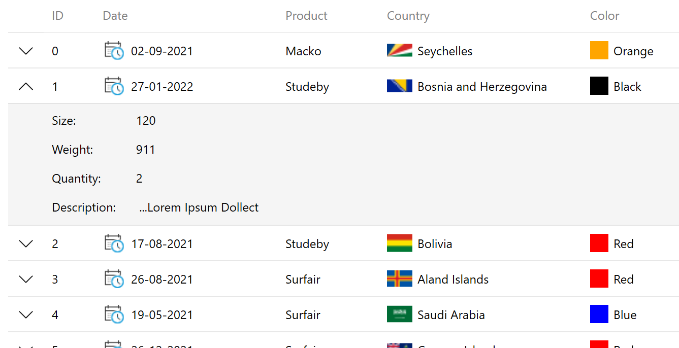
Drill into a row of data to show more details inside a collapsible panel. You can display an input form, a child data grid, or anything else within the detail row. Bind one WPF datagrid to another using FlexGrid and create a master-detail scenario.
Additional Features
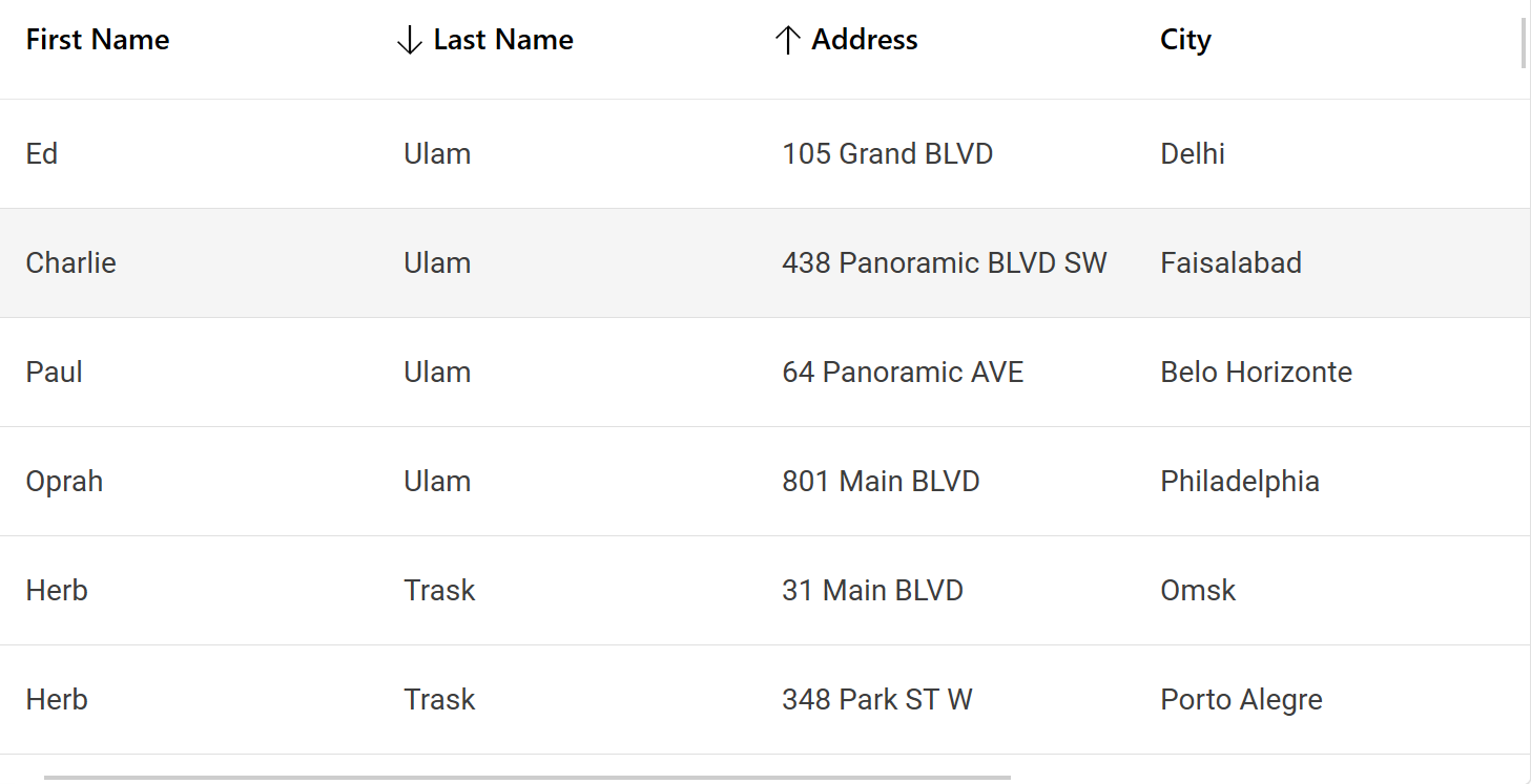
Multi-Column Sorting
FlexGrid supports sorting, ascending, and descending, by clicking on the column headers. It also supports sorting by multiple columns.
Cell Merging
Content-driven cell merging allows you to merge matching adjacent cells across columns and down rows. Merge header cells, create custom cell merging rules, and set restrictions on how FlexGrid merges cells.
Selection
Get Excel-like cell selection across rows and columns. Configure the selection mode per your requirements including checkbox support.
Hover Styles
Highlight cells as the end-user hover over them with the mouse. Configure the hover cell style to appear over single cells, entire rows, or entire columns.
UI Automation and Accessibility
UI Automation (UIA) support enables accessibility applications, such as screen readers, and coded UI testing to examine FlexGrid cell by cell. It also enables simulated user interaction from code.
Export to Excel and Print
You can export FlexGrid to an Excel file (XLSX) files while choosing how to preserve formatting. You can also export or print only selected data. Print the grid directly using basic and advanced print settings.
Add New Row
Add a new row to the database with a tap or click. Adding a blank row to the datagrid allows users to add more rows of data.
Validation
Validate data entry with built-in formatting and error detection, or use unobtrusive validation to validate as the user types.
Live Updates
Create live datagrid displays and dashboards with automatic updates. Show stock prices and other rapidly updating information in your datagrid.
WPF Datagrid Demos
Desktop Demo Explorer
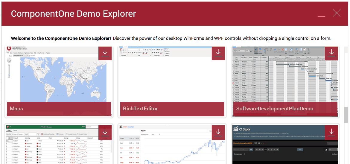
All of our WPF demos are included in a single downloadable desktop explorer. Explore every feature and showcase demos using the Control Explorer demo. Plus, see the WPF datagrid control in action in the AdventureViewer demo.

