
E-Commerce Style Data Filtering for WPF
ComponentOne DataFilter provides a complete a WPF filter interface to accompany any extensive data collection. Filtered data is easier to analyze and allows you to focus on specific information.
- Autogenerate the filter panel UI from the data source or create it manually
- Visually build category-based expressions with the FilterEditor component
- Connect to any data-aware controls such as datagrids, lists, treeviews, and charts
Why Choose DataFilter for WPF?
Separate Filter UI
With DataFilter you can easily separate all your filtering UI to a single panel in your application.
End-User Filtering
DataFilter enables the end-user to build category-based filter expressions quickly at runtime.
Rapid UI Development
The entire WPF filter UI can be generated automatically based up on the data types.
WPF DataFilter Key Features
Filter Different Data Types
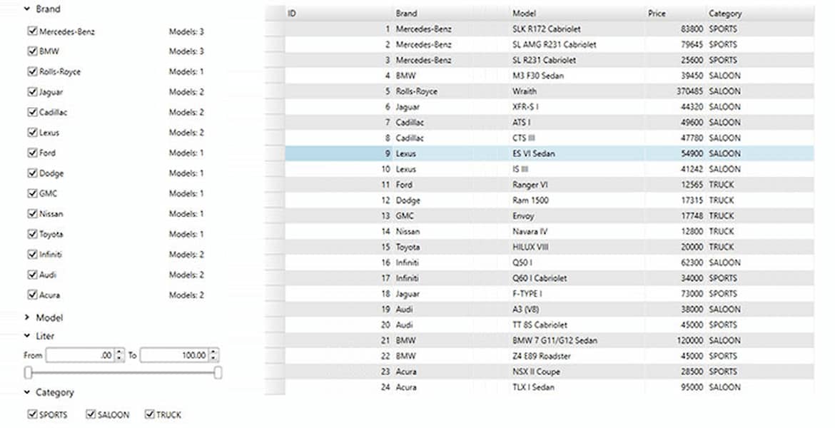
The DataFilter control provides many types of filters, including bool, range, date range, checklist, calendar, and custom filters. These filters can be generated automatically by the control, according to the data. Filters can also be added programmatically. Filter criteria can also be serialized deserialized to xml to easily save and load filter expressions as needed.
Build Conditional Filters
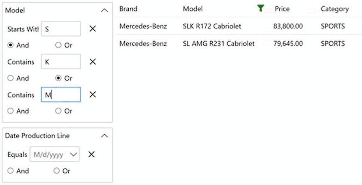
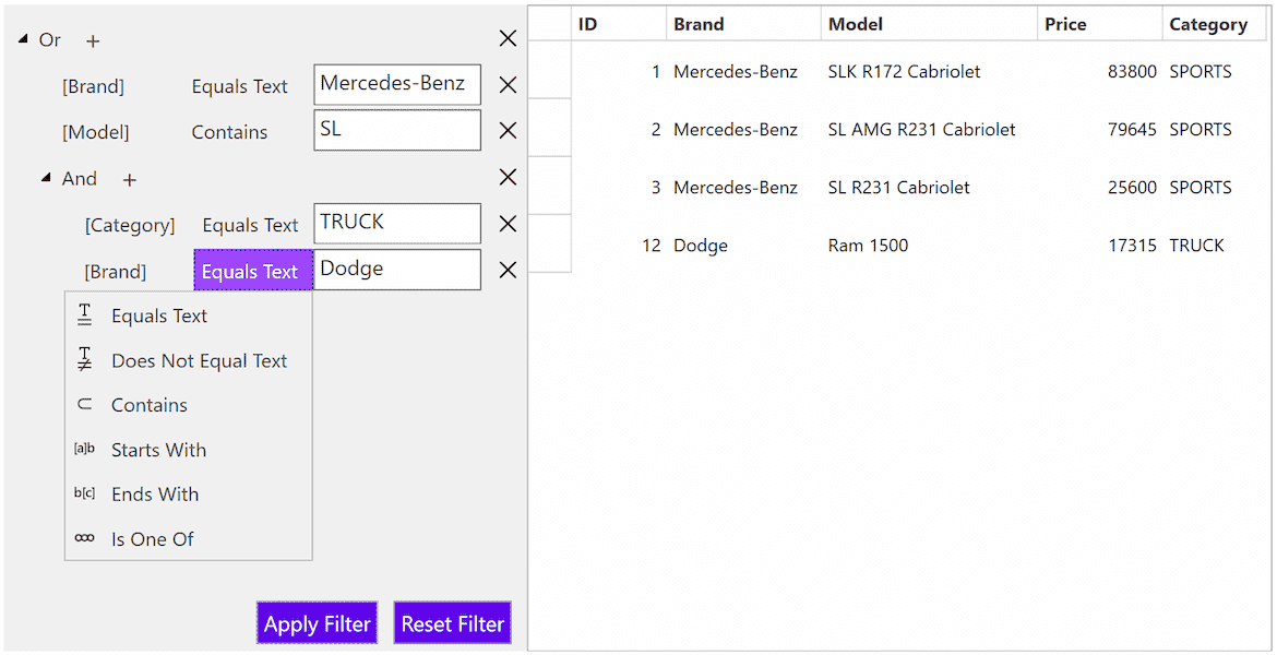
Build a complete filtering UI on the side of your application with support for conditional filters. Conditional filtering lets users filter more precisely with conditions like "Greater Than" and "Starts With" for various data types. Plus, your users can append multiple condition filters together easily using AND/OR logic.
Customize the Filter UI
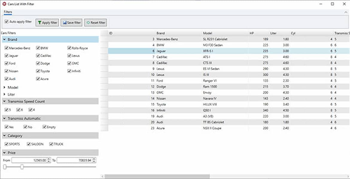
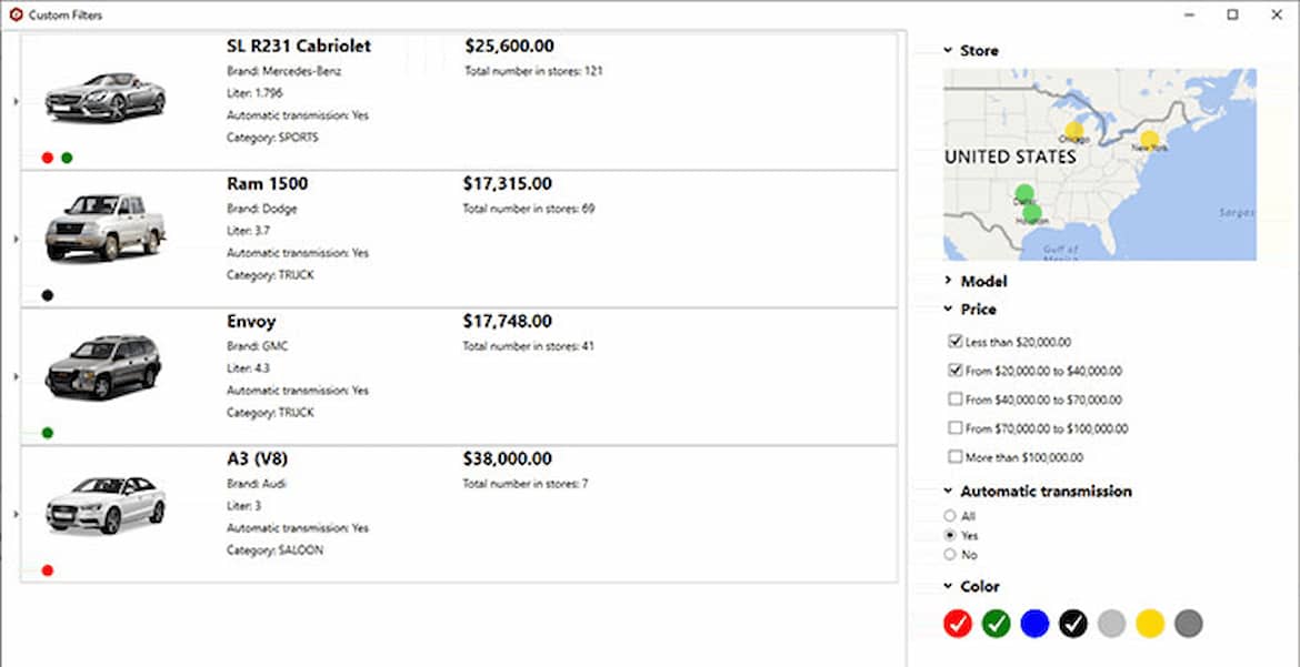
The accordion-based filtering UI can be attached to any control sharing a datasource or plugged into an info screen, and the appearance is highly customizable. The DataFilter control provides dedicated class for each of its element which makes it easier to customize the appearance of the control and its elements. Provide additional information about the filters in a custom tooltip.
Filter any Data-Aware Control
The DataFilter control can be easily paired up with any data-aware control like data grids, lists, treeviews, charts or maps. It also works with standard out-of-the-box Microsoft controls.
Show Filter Summaries
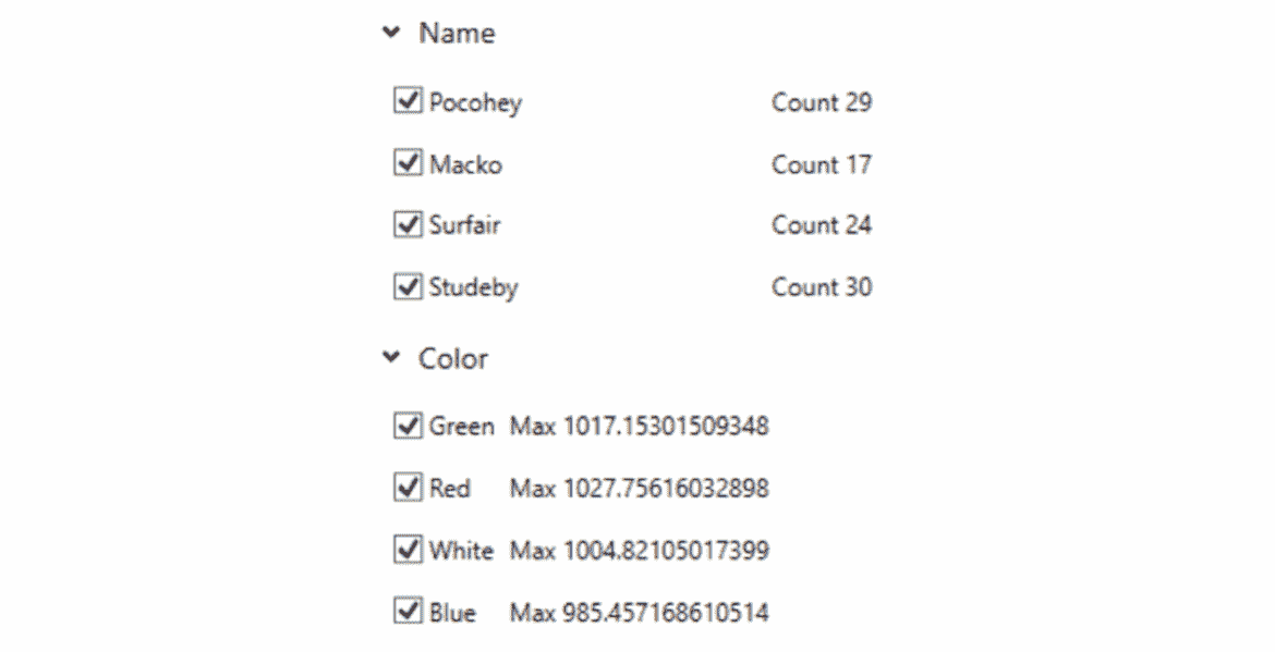
The DataFilter control allows you to configure and display aggregate summaries for each filter. This feature makes it easier for you to analyze the count, sum, maximum, and minimum values of the filter items.
Visually Build Expressions with FilterEditor
The additional FilterEditor component works with the DataFilter and enables the end-user to build complex, category-based and/or filter expressions quickly. The control can be bound to a data source, and it will automatically provide visual options to create expressions based on available fields.


