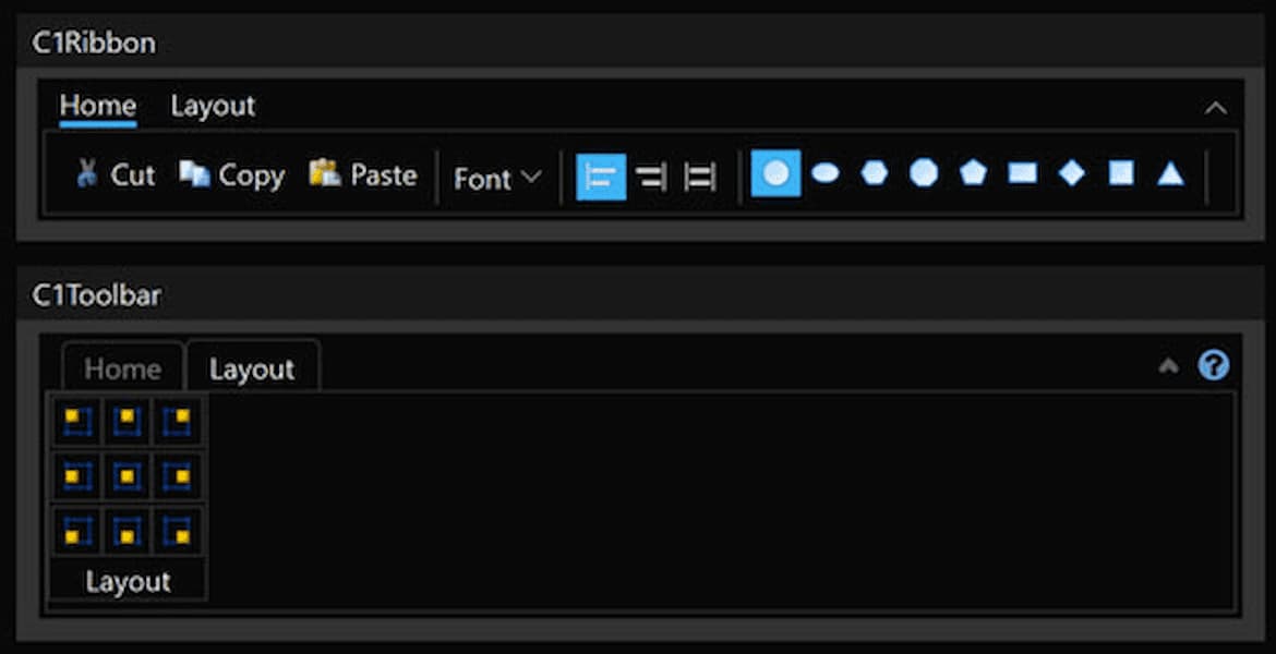
Simplified WPF Ribbon UI
Complete your desktop apps with a fluent ribbon-style toolbar based on UI concepts from Microsoft Office 365. The ComponentOne Ribbon for WPF includes:
- Simplified view when the ribbon is collapsed.
- Overflow support when the ribbon is resized.
- ToolStrip component to create simple toolbars.
- Office 365 style with active tab indicators.
Why Choose Ribbon UI for WPF?
Improve the Look and Navigation of Your WPF Apps
ComponentOne Ribbon for WPF provides a modern, simplified ribbon that also works as a basic toolbar, providing a single-line collapsed state, or a three-line ribbon-like appearance.
A Simpler, Better Version of the Microsoft Ribbon
Microsoft provides a Ribbon control for WPF .NET 4.0, but the control large, complicated, and not always straightforward to customize. ComponentOne Ribbon for WPF is a simpler alternative.
WPF Ribbon Key Features
Collapse the Ribbon for a Simplified View
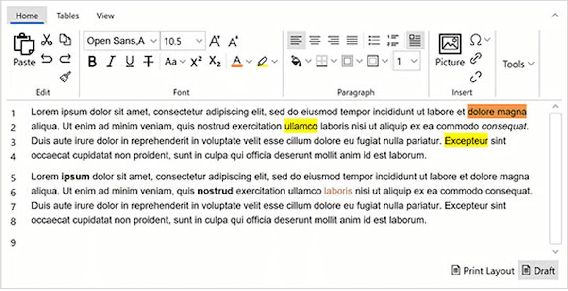
The WPF Ribbon control supports a collapsed, simplified view designed to help users focus on their work and collaborate naturally with others. Commands that do not fit in the simplified view become accessible from a drop-down menu. People who prefer to allow more space for the commands will still be able to expand the ribbon to the classic three-line view.
Responsive Overflow Support
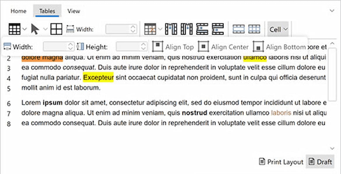
Build your custom WPF toolbar by organizing buttons into tabs and groups. Define the layout of large and small-sized buttons, and the C1Ribbon control will automatically scale the icon and display text accordingly. Tabs contain groups, and groups may contain any combination of buttons, dropdowns, splitbuttons, or any UI element you want.
Customize the Ribbon Tabs and Groups
When the user resizes the form, C1Ribbon will automatically collapse groups into a dropdown pane. There is no need to worry about creating toolbars that are too long. All buttons can be reached by the user on any size device.
A Light ToolStrip Component for Small Forms
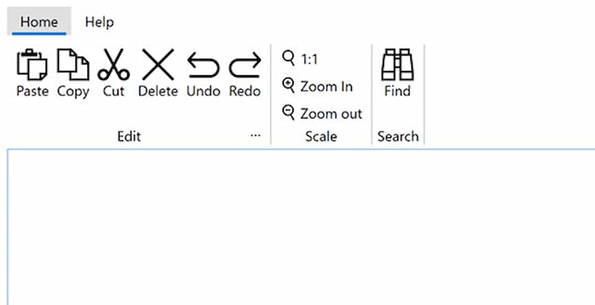
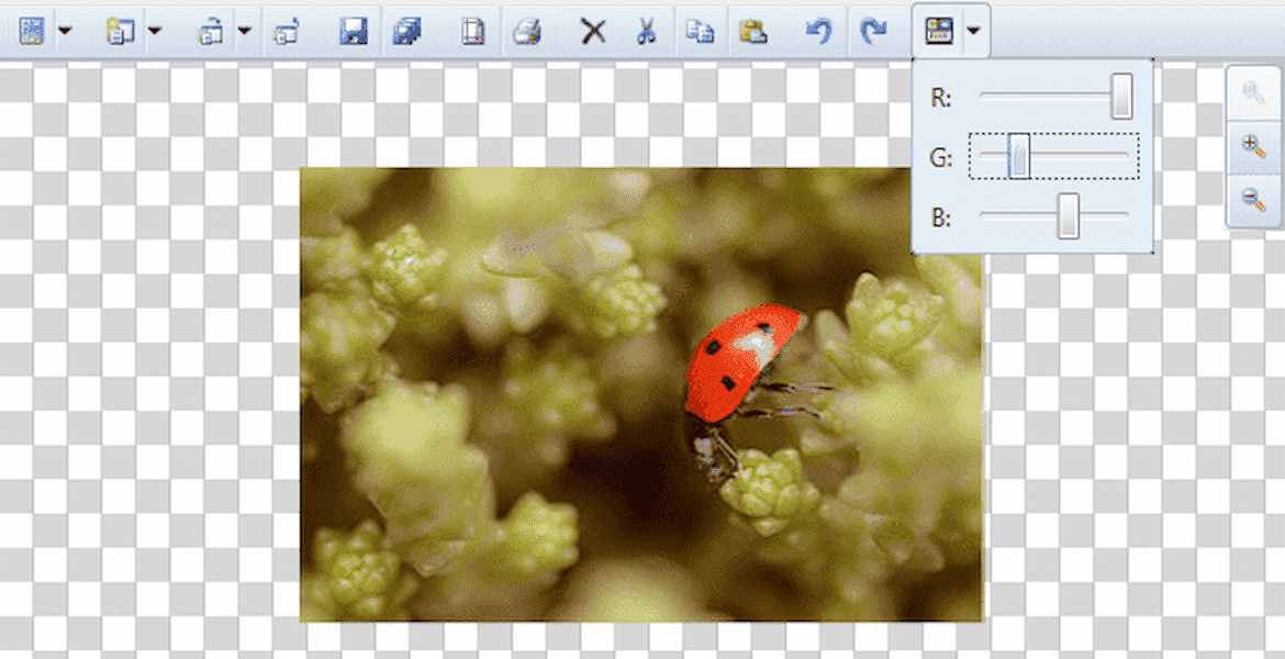
ComponentOne Ribbon for WPF also includes a lightweight C1ToolStrip component for simple and small forms that don't need a full ribbon. The C1ToolStrip can be oriented vertically, and supports the same overflow features as C1Ribbon so all commands remain visible to the user.
Simple Styling and Themes Support
The C1Ribbon control for .NET 6+ supports easy styling with brush properties - no need to customize the control template.
The C1Toolbar and C1SimplifiedRibbon controls for .NET Framework support easy styling with brush properties, and several built-in themes including Office, Material, Expression, Cosmopolitan and more.
