Custom WPF Rating Control
Enable desktop users to rate content such as books, movies, online blogs, and recipes with ComponentOne Rating for WPF.
- Present the rating control horizontally or vertically
- Customize the shape of the rating icons
- Add special effects with animations
Why Choose Rating for WPF?
Collect User Feedback
Collect user input through a touch-friendly and attractive UI instead of a plain textbox or dropdown.
Visualize Rating Data
Use the WPF Rating control to visualize user ratings and scores within your datagrids and dashboards.
Customizable
You can customize the shape template, direction and animation effects applied to the rating icons.
WPF Rating Control Key Features
Customize the Rating Icons
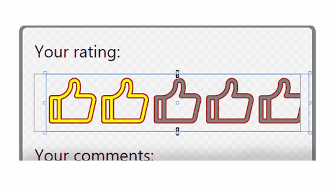
The WPF rating control allows you to customize the appearance of the icon. Use custom templates to alter the icon shape and color. For example, you can design the shape to be a heart, circle, balloon, or thumbs up.


Built-In and Custom Animations
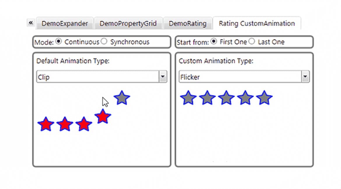
Add special effects to the WPF rating control. Use predefined animation types like a scroll, bounce, fade, or slide, or create custom animations.

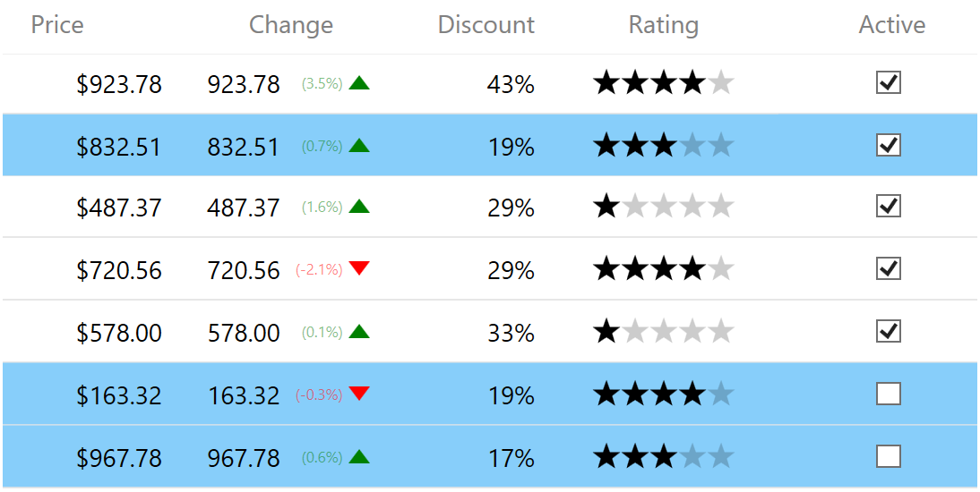
Embed Ratings within Datagrid Cells
The WPF rating control can be used as a simple visualization control within your datagrid cells and dashboards. For example, you can customize your FlexGrid cell template to include C1Rating bound to a Rating field in your dataset. Make the cell editable or keep it read-only.


