A Modern WPF Progress Bar Control
Visually indicate progress of a lengthy operation with ComponentOne ProgressBar for WPF.
- Get two controls for classic and modern-style progress indication
- Display animated dots or loading rings for indeterminate operations
Why Choose ProgressBar for WPF?
Get Loading Dots
The ComponentOne WPF ProgressBar control provides the modern loading dot animation for indeterminate progress.
Get a WPF Busy Indicator
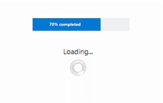
The ComponentOne WPF ProgressIndicator control provides an animated busy indicator as an alternative progress bar.
High Performance
The progress controls don't block the UI thread from running, so you can show a progress indicator while the background UI is performing an operation.
WPF ProgressBar Key Features

Indeterminate Progress Indicators
The ComponentOne WPF ProgressBar controls are modeled after the native progress indicators found on newer versions of Windows to provide a modern experience. For indeterminate operations, the C1ProgressBar control can display as an animated trail of dots, and the C1ProgressIndicator control can display as an animated ring.
Busy Indicators
The ProgressIndicator control gives you a more customizable way to visualize some indeterminate action. You can display a classic loading ring and provide a descriptive label for the user.


