
Linear & Radial Gauge Controls for WPF
ComponentOne Gauges for WPF includes several gauge controls to enhance your data visualizations and business dashboards.
- Get fluent, modern looking radial and linear gauges
- Customize your gauges with marks, labels, and ranges
- Collect user input with interactive knob-style gauges
Why Choose Gauges for WPF?
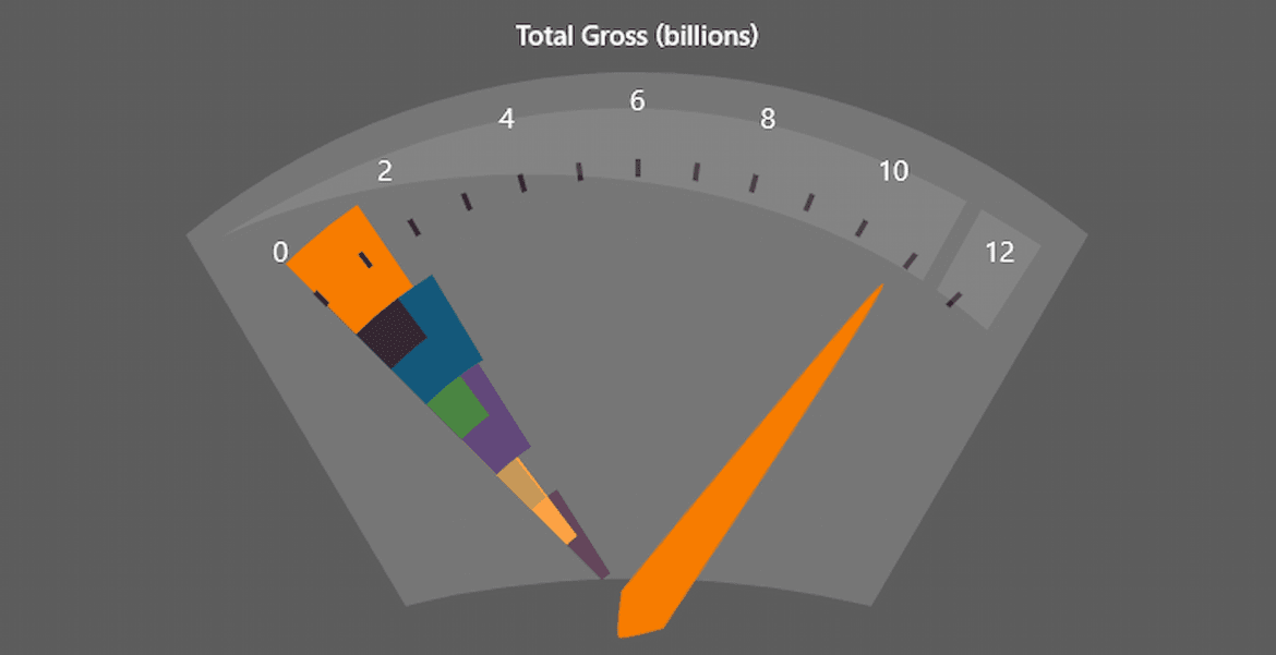
Create Dynamic Dashboards
Gauges add a unique style to your business dashboards. Bring your data visualizations to life with eye-catching and interactive gauges.
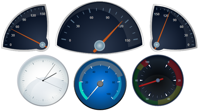
More Gauge Options
The WPF Gauges include several different gauge controls to choose from beyond the basic radial and linear gauges.
Create Highly Styled Gauges
In addition to flat, modern styles, the .NET Framework WPF Gauges support face and cover plates for more stylized looks.
.NET WPF Gauges
These gauges are supported for .NET 6+.
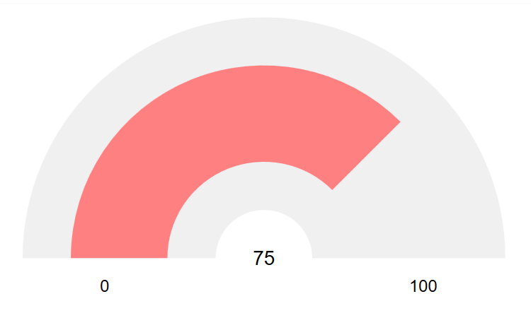
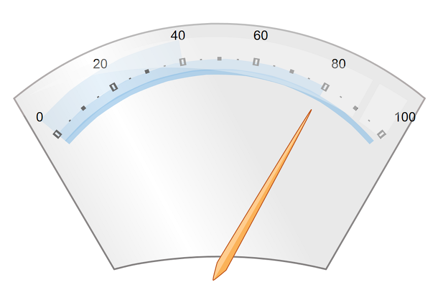
Radial Gauge
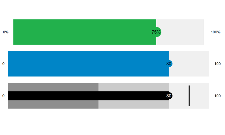
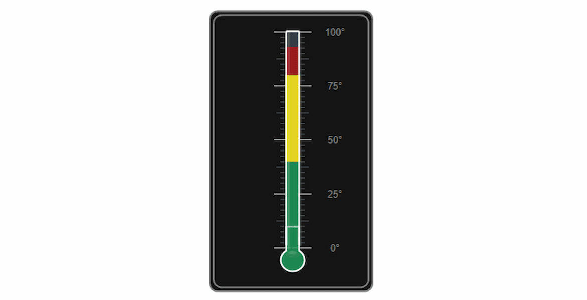
Linear & Bulletgraph Gauges
.NET Framework WPF Gauges
These gauges are supported for .NET Framework 4.5.2+.
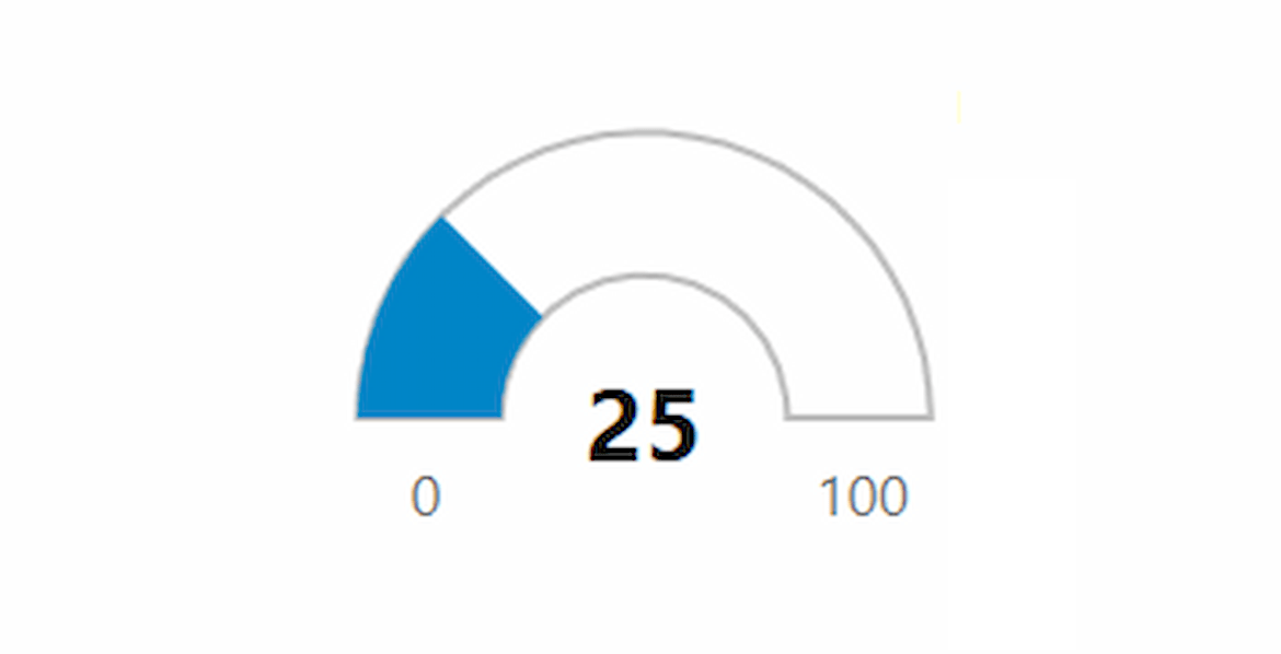
Radial Gauge
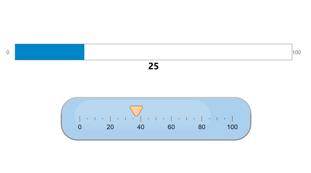
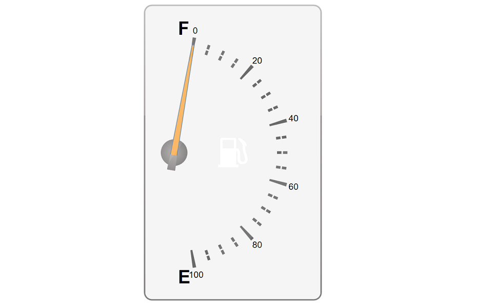
Linear & Ruler Gauges
Speedometer
Volume Gauge
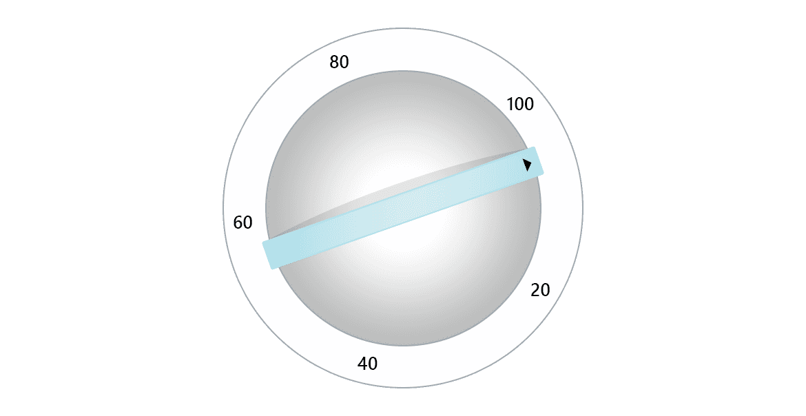
Interactive Knob

Interactive Region Gauge
WPF Gauge Key Features
Customize Your Gauges with Decorators
ComponentOne Gauges have a simple, yet flexible object model. Set a few properties to change the pointer cap size and appearance. Add any number of decorators (tick marks, labels, and ranges) to the gauge at any position.
Flexible Data Binding
Bind the gauge values and ranges in XAML following MVVM best practices. The gauges also support an off mode for when the value is null or it falls outside the range.
Create Professional-Looking Gauges
Our WPF Gauges for .NET Framework have properties that provide extensive customization without requiring any changes to the XAML template. You can customize the face plate and cover to create professional-looking gauges with lighting and glass effects. Of course, you can extend and customize the gauges further by modifying the provided control templates.
Additional Features
Interactive and Touch-Enabled
Users can tap or drag the pointer to select a value. Interactive gauges are an alternative to text-based editors or sliders and create a unique experience for users.
Animation Support
Add animation to the gauge by moving the pointer using C# or VB.NET code.


