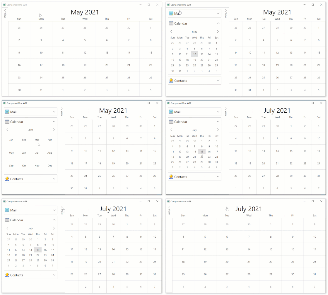
A Fluent WPF Accordion Component
Display a list of expandable items with ComponentOne Accordion for WPF.
- Organize content in collapsible panes
- Smooth animation when collapsing & expanding
- Expanded layout in any direction
- Fluent style with easy customization
Why Choose Accordion for WPF?
Optimize Layout
The WPF Accordion can be used as a layout control to organize content on multiple, collapsible panels or menu items for navigation.
Create a Collapsible Side Bar
Use the WPF Accordion to create your application's side bar with collapsible groups. Put the entire control in an Expander to collapse to edge.
Drill-Down Alternative
You can use the WPF Accordion control just like datagrid bound to your data set with detail drill-down by expanding each item.
WPF Accordion Key Features
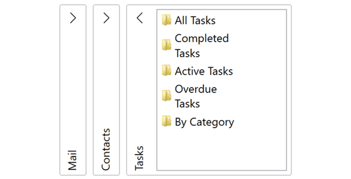
Set Expand Direction and Fill
Expand the accordion up, down, left, or right. The default setting, down, displays content below each header. Customize the fill behavior with a single property setting. When the WPF Accordion is set to Fill, items will expand to the full available space on the screen.
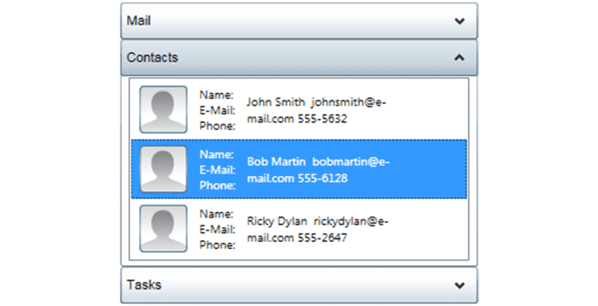
Flexible Data Binding and Drill-Down
Because the WPF accordion control inherits from ItemsControl, you can bind it to any collection of data objects. Use the control to provide drill-down on a list of items and, like any ItemsControl, use a data template to create a visual representation of each item.
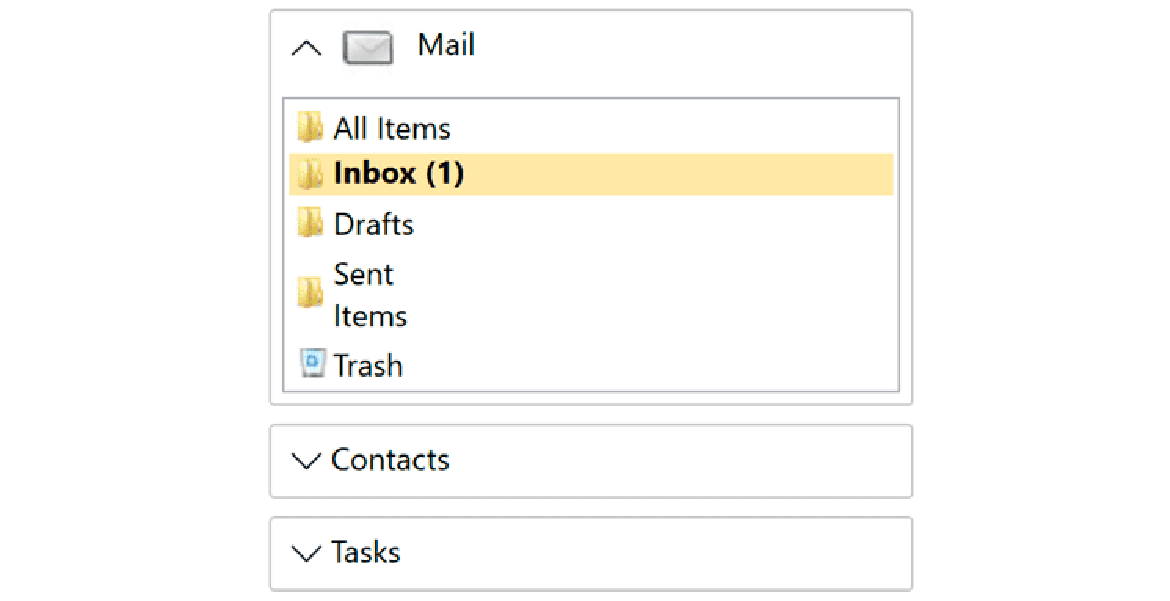
Customize the Accordion Header & Icons
Each accordion pane's header and content can be customized with both text and controls. You can also customize the expand icon position and direction. For example, you can display an icon and text in each header.
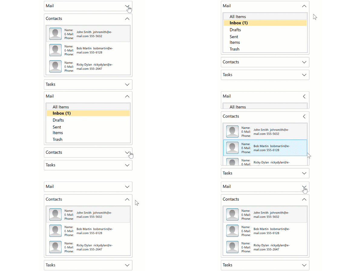
Collapse & Expand Animation
Complete with smooth animations, the WPF Accordion provides a visually compelling interface for a menu or a navigation bar in your application. The control also supports expanding all or a single pane at a time using the ExpandMode property.
Simple Expander for Single Panels
Use the simpler WPF Expander component to expand and collapse a single UI container. The Accordion combines multiple Expanders, but you can use the C1Expander component separately. Customize the header with any UI controls, expand the control in any direction, and choose whether or not it’s expanded upon page load.
