A High Performance Blazor ListView Control
Provide your users with a data-bound list of items for selection. The ComponentOne ListView control for Blazor supports data-binding, selection, item customization, and more!
- Perform asynchronous data operations such as sorting, grouping & filtering on the server or client
- Works great with large data sets thanks to on-demand loading and built-in paging
- Enable single item and multiple item range selection
- Customize list item templates using HTML & CSS
Why Choose ListView for Blazor?
Manipulate Lists of Data
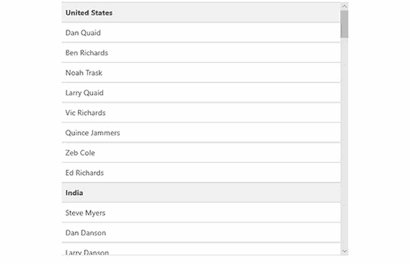
Our Blazor ListView control supports sorting, grouping and filtering like a datagrid, but all within a simple, scrollable list.
Provide Multi-Selection
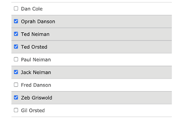
Our Blazor ListView supports multiple, non-adjacent item selection so you can add checkbox-style selection functionality with ease.
High Performance
Display large data sets in your Blazor ListView efficiently with support for data virtualization techniques that load data in batches or pages as the user scrolls.
Blazor ListView Key Features
Sort, Group and Filter Data
Get a Blazor ListBox control with support for essential data operations typically found in a datagrid control. With ComponentOne ListView you can sort the listview asynchronously in either direction, organize and display the selectable list of items under grouped headings, and enable asynchronous, full-text filtering on the listview from text input. And of course, data bind the listview to any enumerable list of objects.


Handle Large Data Sets with Paging and Virtualization
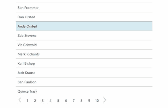
Handle large data sets efficiently with traditional paging or a data virtualization technique that loads data in chunks as the user scrolls.
- Paging - the data loading is handled virtually in sections with page number navigation.
- Virtualization - the data is loaded by sections in one long list as the user scrolls, and the Blazor ListView knows the total number of rows so the scrollbar is always sized and positioned accurately.
- On-Demand Loading - the ListView populates items as the user scrolls, but the scroll bar size and position changes as more data is loaded into view since the list does not know the total number of rows.
The paging and virtualization techniques are supported with the help of ComponentOne DataCollection.
Customize Your ListView with Templates and Item Range Selection
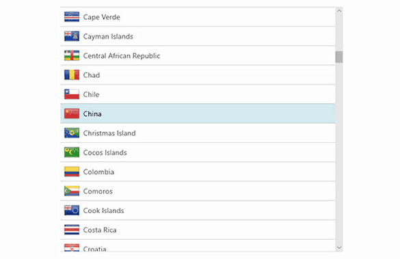
- Customize the item template to display other elements within the list, such as images and checkboxes. The template for each list item can be customized to include any HTML or CSS
- Enable single item or multiple item selection. The listview supports single and range selection modes


Multiple Item and Range Selection
Enable single item selection, range selection, or multiple item selection. In addition to adjacent item selection, our Blazor ListView control supports multiple, non-adjacent item selection using the mouse and keyboard. Display checkboxes to help visualize the selection by setting one property.


