A Powerful DataGrid for Blazor Applications
Power your next web application with the industry's fastest and most powerful C# .NET datagrid.
- FlexGrid is a complete Blazor datagrid component that enables tabular data editing, sorting, filtering, and grouping
- Get fast performance on the client with FlexGrid's data virtualization features and built-in analysis tools
Overview
A Blazor datagrid is a user interface control for displaying, editing, and analyzing large data sets. FlexGrid is a Blazor datagrid optimized for high-performance and flexibility, enabling .NET developers to customize every aspect of the control.
Why Choose FlexGrid for Blazor?
The Best C# Datagrid for the Web
FlexGrid for Blazor has been developed natively from the ground up, ensuring optimal performance on the platform, and supporting every essential datagrid feature.
Familiar, Excel-Like Experience
FlexGrid delivers features similar to Microsoft Excel, such as cell selection and editing, so your datagrids will be intuitive and your end-users will be more productive.
Optimized for Large Data Sets
FlexGrid is designed to aid large data sets with features like grouping, aggregation, and on-demand loading with data virtualization features.
All-in-One Data Management
FlexGrid is primarily used for editing, visualizing, and analyzing tabular data, and is packed with features that data entry and business analysts will love.
Touch Enabled and Responsive Layouts
The Blazor datagrid has been designed with web and mobile users in mind. Get built-in touch support and responsive column layouts that look nice on any device.
Fluent Style for Modern Applications
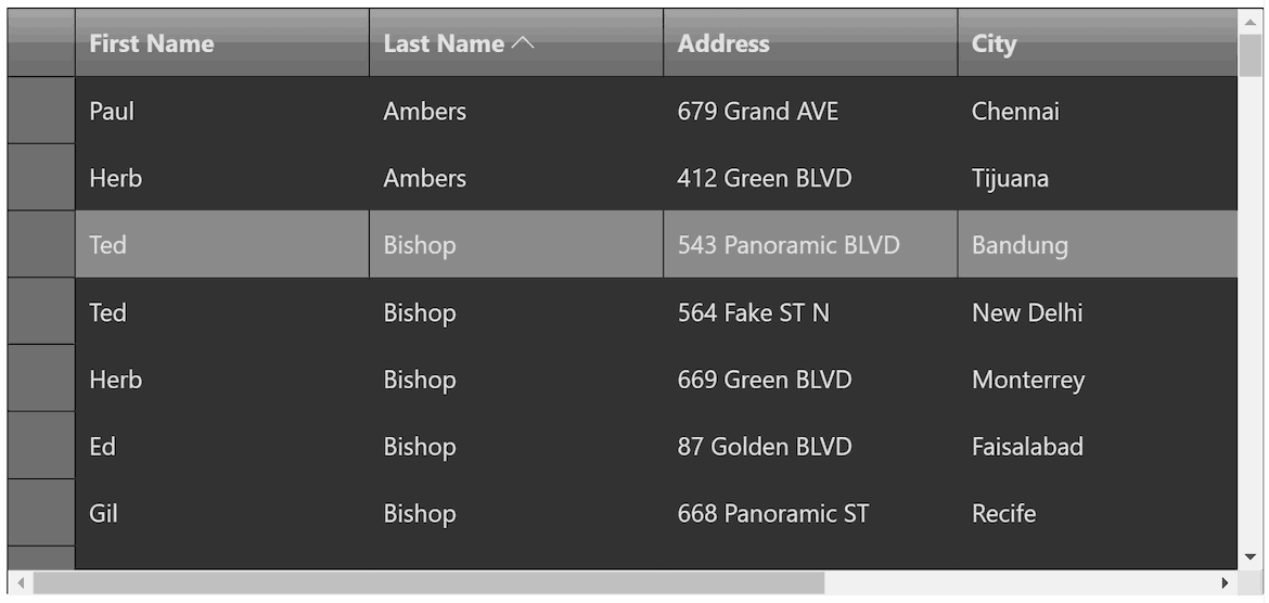
The .NET Blazor controls feature built-in fluent styles which are minimal and modern, and they support both light and dark themes.
Blazor Datagrid Key Features
Data Bound or Unbound
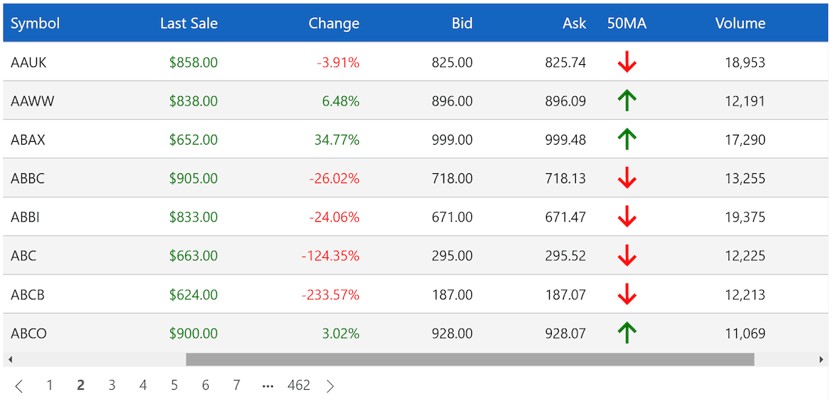
Get started quickly with automatic column generation when data binding to .NET data source objects or custom business objects. Create custom columns with images, numeric input, date, time, or whatever your application needs. FlexGrid also supports an unbound mode, giving you complete control over creating each row, column, and cell value.
Custom Cells
Conditional Formatting
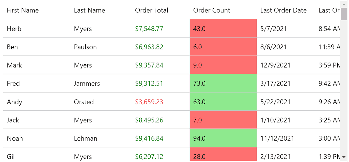
Apply conditional formatting to highlight values that meet any criteria. FlexGrid provides a flexible cell formatting API with C# and VB.NET Cell Factories.
Cell Editors
FlexGrid supports inline editing or pop-up editing. Several built-in editors enable efficient editing for numbers, dates, checkboxes, and data-mapped combo-boxes. Create custom columns with images, numeric input, date-time and more.
Loading Large Data Sets
Virtual Mode
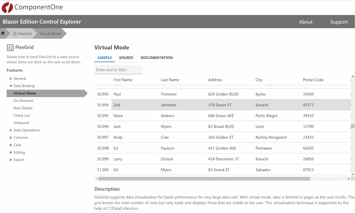
Improve performance and reduce load times for very large data sets with on-demand loading, where data is only retrieved as the user scrolls. This feature is also known as "just-in-time data loading" and is supported in FlexGrid through the DataCollection component.
On-Demand Loading
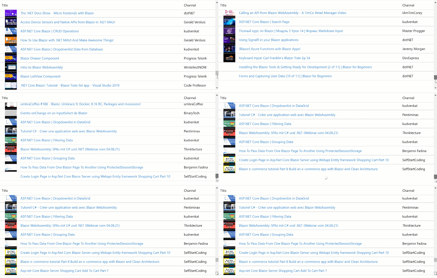
With on-demand loading, FlexGrid loads items as the user scrolls. This is different from virtual mode because the grid never knows the total number of rows, so the scroll bar size and position changes as more data is loaded into the grid. This virtualization technique is supported by the help of the DataCollection component.
Filtering
Filter Row
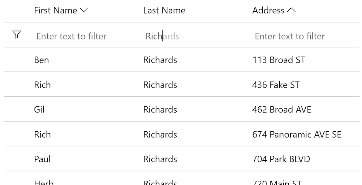
Display a traditional filter row at the top of the Blazor datagrid to allow filtering on multiple columns.
Excel-like Filtering
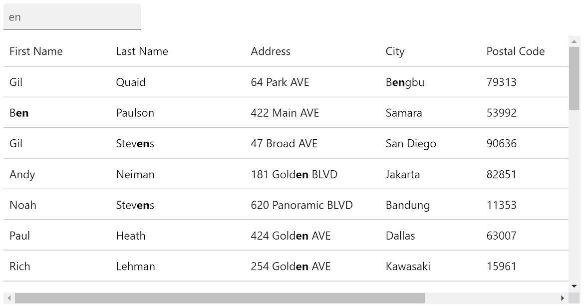
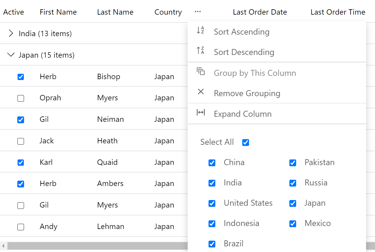
Enable filtering on any column's data by condition or value. FlexGrid supports drop-down filters in the column headers like Microsoft Excel with special filter editors for different data types.
Grouping and Aggregation
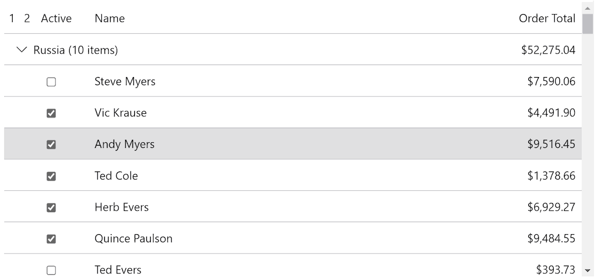
Enable runtime data grouping to help analyze large data sets. Display grouped data with a customizable group header and aggregated values. Grouping in FlexGrid is supported through the DataCollection component.
Drill-Down Details
Drill into a row of data to show more details inside a collapsible panel. Collapsible row details provide an alternative approach to displaying additional or hierarchical information about a data row. Load row details on-demand–reducing the amount of data needed to render the initial Blazor datagrid.
Selection and Clipboard
Cell Selection
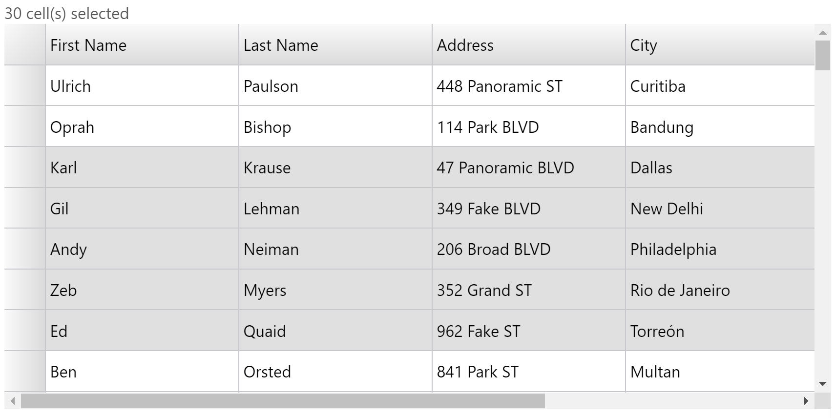
Provide drill-down or additional analysis on user selections. FlexGrid supports several selection modes, including cell, cell range, row, row range, and column selection. It also supports non-adjacent cell and row selection by holding the CTRL key. You can enable checkbox selection and a customizable mouse-over style.
Clipboard Support
FlexGrid supports clipboard actions for copying data to and from the Blazor datagrid. When users select any row or column in FlexGrid, they can open a selection context menu. The selection menu provides clipboard operations such as cut, copy and paste.
Styling and Appearance
Provide a custom skin or theme for your Blazor datagrid by simply setting properties – no need to learn CSS for styling the datagrid. Quickly change brushes for selection, mouse-over, column headers, row headers, and alternating rows. FlexGrid for Blazor also supports light and dark themes, so you can easily skin your entire application.
Additional Features

Column Reordering and Resizing
FlexGrid allows users to modify the column order by dragging and dropping their headers. Also, users can resize columns in Blazor Server or WebAssembly applications.

Cell Merging
FlexGrid supports content-driven cell merging. This allows you to merge matching adjacent cells across columns and down rows. Merge header cells, create custom cell merging rules, and set restrictions on how FlexGrid merges cells.

Adaptive Column Sizing
FlexGrid allows you to specify column sizing in code, as well as allow users to resize columns at runtime. Additionally, columns can be set to proportionally fill the space (also known as "star sizing").

Multi-Column Sorting
FlexGrid supports sorting, ascending, and descending, by clicking on the column headers. The Blazor datagrid also supports sorting by multiple columns and icon customization.

Row and Column Freezing
FlexGrid for Blazor offers Excel-like row and column freezing. This allows users to keep rows and columns in view as they navigate the content of the datagrid.

Add New Row
Add a new row to the database with a tap or click. Adding a blank row to the Blazor datagrid at the top or bottom allows users to add more rows of data.

Edit Confirmation
Inline editing makes it easy to modify any cell by double-clicking quickly. Prevent erroneous edits to the data with edit prompts and confirmation for the end-user.

Pop-Up Edit Form
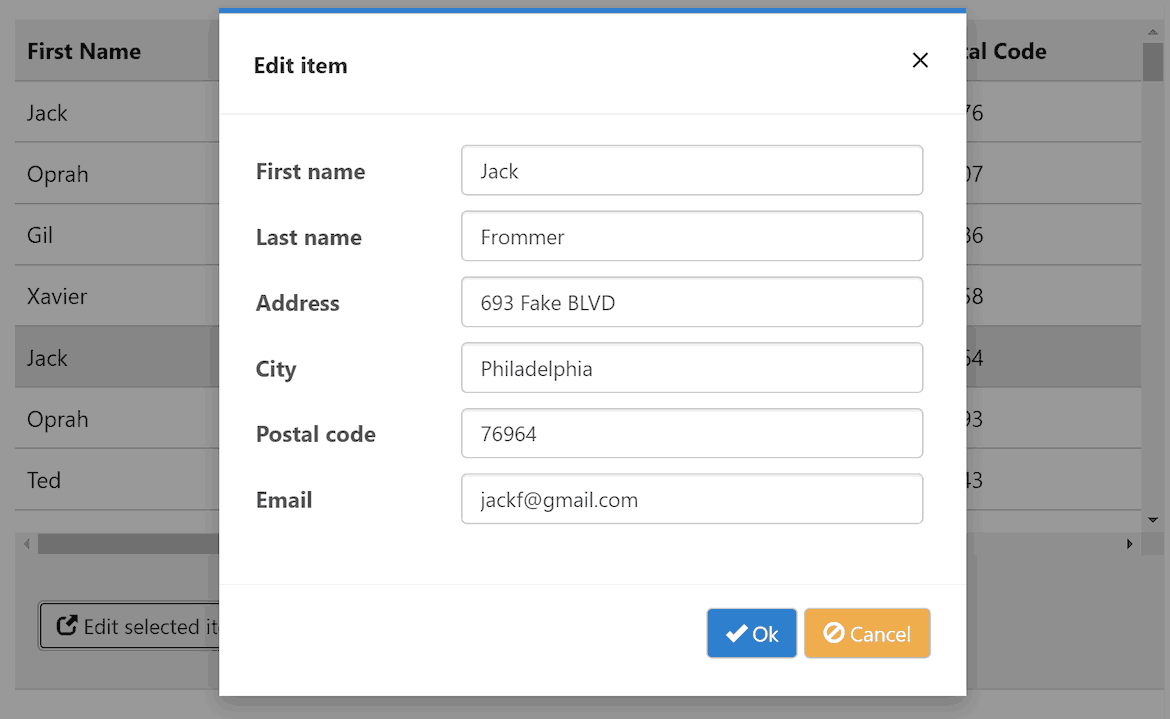
Provide an alternative technique to edit the Blazor datagrid using a pop-up form window along with Blazor input controls.

Export
Save your Blazor grid to common formats, including CSV, text, and HTML. Plus, in Blazor Server applications, you can export the datagrid as displayed with cell styles to Microsoft Excel (XSLX).
Blazor Datagrid Demos
Blazor Control Explorer
Explore every FlexGrid feature in a WebAssembly (clientside) or Blazor Server application. Configure properties at run-time and view the underlying source for any demo.
Flight Statistics Dashboard
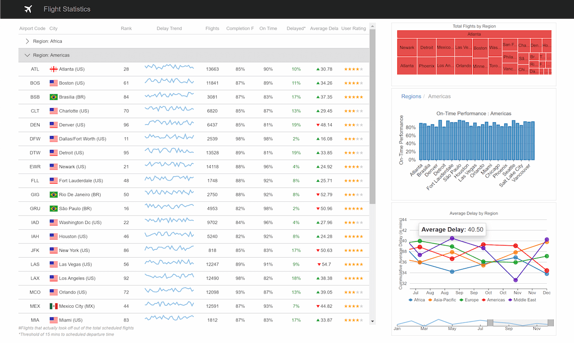
See a real-world dashboard built using entirely ComponentOne Blazor components. View flight statistics in a FlexGrid with row selection that drills down to visualize data on FlexChart for a region or city.
Featured Blogs, Videos, and Other Resources
ComponentOne Customer Feedback and Awards

"Prompt responses, quality feedback, and help with code examples. Fantastic service!"
RICHARD HERBERT

"Excellent product with good support"
MIKE WEBSTER

"I am very appreciative of the effort your entire team gave to make this transaction happen. Thank you for your efforts!"
SAM COLE
Trusted by the World's Leading Companies


