
Blazor Pop-up Window and Tooltip Components
Your Blazor Server and WebAssembly apps are not complete without pop-ups! The ComponentOne Window and Tooltip components provide a variety of ways to display pop-up information.
- Display modal and modeless windows that can be resized, dragged, and closed.
- Add floating pop-ups when the user hovers or clicks an element.
- Collect user confirmation with a dialog prompt window.
Why Choose Window for Blazor?
Create Modal Windows
Add modal windows to your Blazor application to force user input before they close the dialog.
Quickly Create Confirmation Dialogs
Quickly create and display confirmation and prompt message boxes to the user from your C# code without having to design the UI.
Display Blazor Pop-Ups
Create simple pop-ups or fly-outs that can display any UI content upon click or mouse hover.
Blazor Pop-Up Window Key Features
Display Modal and Modeless Windows
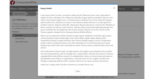
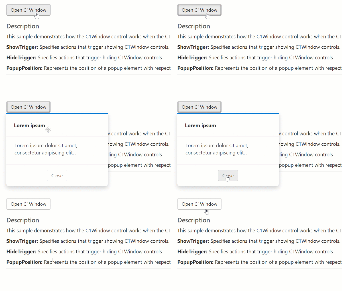
Create and display windows of content that appear modal or modeless. Modal dialogs prevent the user from navigating away from the popup. With modeless windows, you may display multiple, overlapping windows. With C1Window, you can even provide a dark overlay that draws attention to the popup content.
Resize and Maximize the Blazor Window
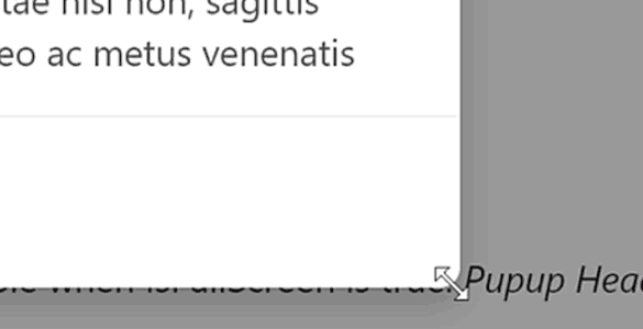
The Blazor popup window can be resized by the end-user. Enable or disable this feature on the control. Or, you can set C1Window to display at full-screen.
Drag and Move the Blazor Window
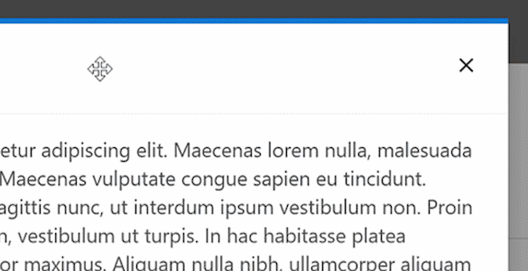
The Blazor popup window can be dragged by the end-user. Enable or disable this feature on the control. Modal windows cannot be dragged.
Quickly Create Prompt and Confirmation Dialogs
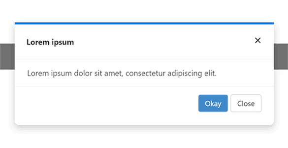
The Blazor window component can be used to implement static methods for showing confirmation and prompt dialogs. You can obtain the user's result and customize the OK and Cancel button text.
Display Simple Floating Pop-ups
Use the Blazor window component as a simple pop-up that can display upon click or mouse hover. Attach the Blazor pop-up to any UI element as its owner and set the display position. Specify if the pop-up should be closed by clicking the owner, the pop-up, or by losing focus (blur).
A Simple Blazor Tooltip Component
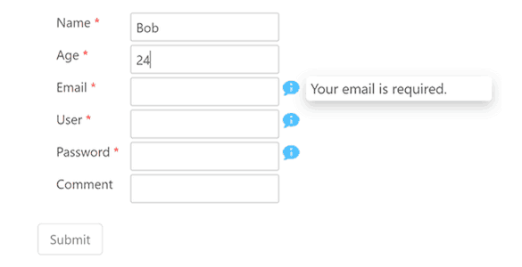
Use the C1Tooltip component to provide simple tooltips for any Blazor UI. The Blazor tooltip can contain any custom HTML and be positioned at any location around its parent element.


