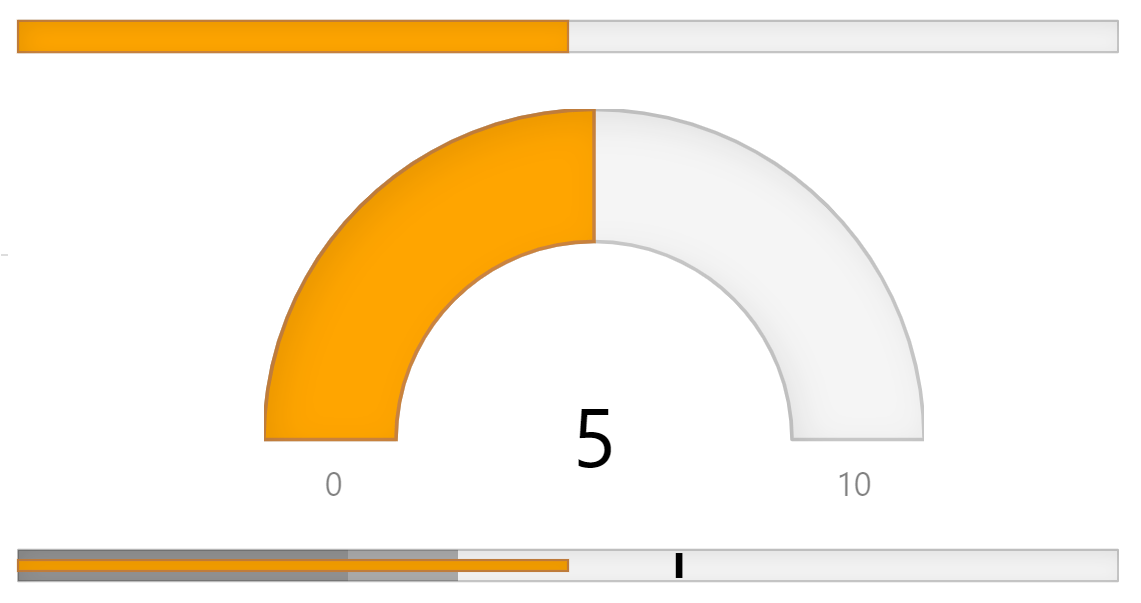
Dynamic ASP.NET MVC Gauge Controls
Add linear and radial gauges to visualize your data in dynamic and unique ways. ComponentOne Gauges for ASP.NET MVC includes:
- Radial and linear gauge controls that can be designed easily with minimal code
- Special BulletGraph control that displays a single value against comparative ranges
- Support for labels, ranges, and needles to embellish your dashboards
Why Choose Gauges for ASP.NET MVC?
Display Key Measures on Dashboards
Gauges are better than simple labels. Bring your data views and dashboards to life with eye-catching and interactive gauges.
Easy Customization
Restyle the MVC Gauges by just changing a few properties to get custom shapes, colors, fills and more.
Scalable & Pixel-Perfect
The ASP.NET gauge controls support vector-based graphics so they render perfectly in any size and resize proportionally.
Types of ASP.NET MVC Gauges
ASP.NET MVC Radial Gauge Control
The Radial Gauge control displays a circular scale with an indicator that represents a single value and optional ranges to represent reference values. You can use the gauge as a simple indicator or use it as input control. Customize the radial shape to create circular or semi-circular gauges.
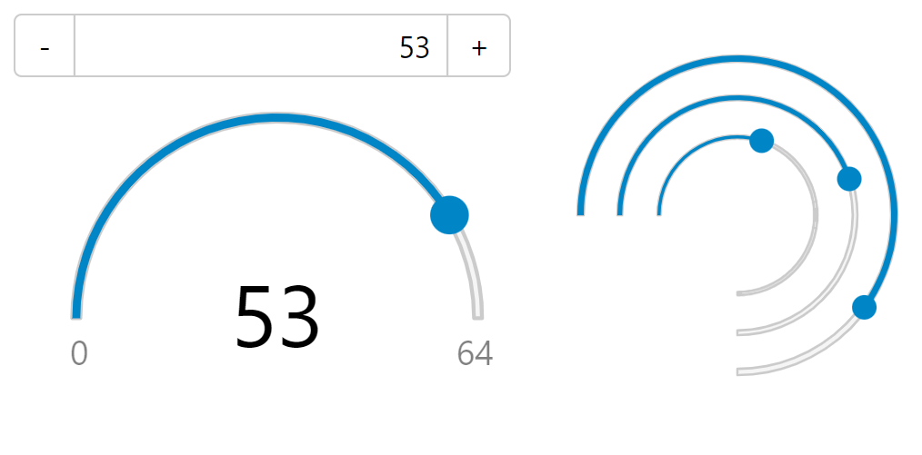
ASP.NET MVC Linear Gauge Control
The Linear Gauge control displays a linear scale with an indicator that represents a single value and optional ranges to represent reference values. You can orient the gauge horizontally or vertically, display ticks, and use the gauge as an input control similar to the HTML range input type.
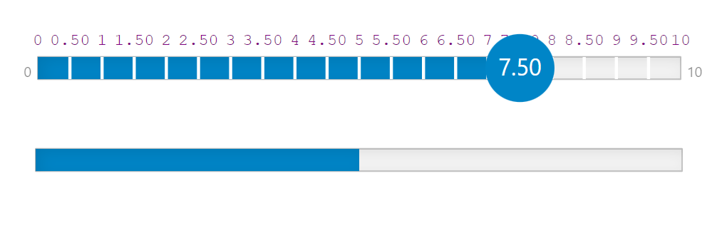
ASP.NET MVC BulletGraph Control
The ASP.NET MVC BulletGraph control is a type of linear gauge designed specifically for dashboard usage. It displays a single key measure — along with a comparative measure and qualitative ranges — to instantly signal whether the measure is good, bad, or in some other state.
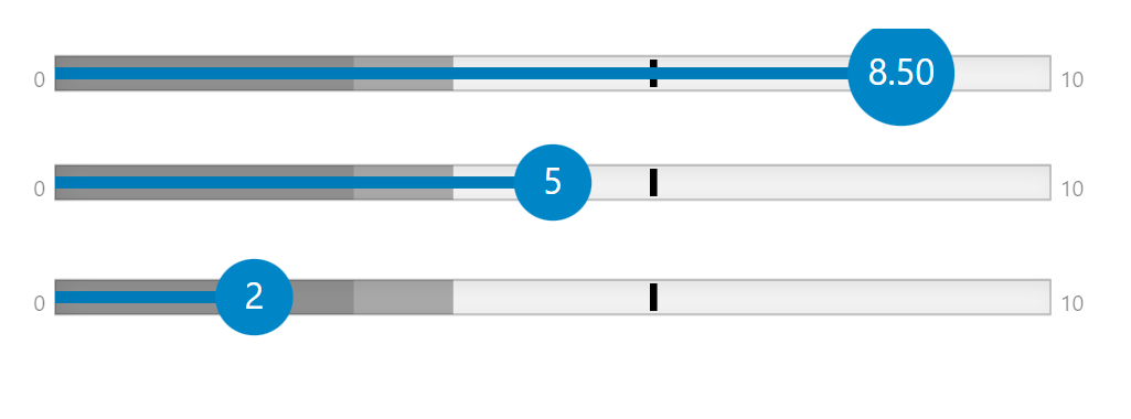
ASP.NET MVC Gauges Key Features
Display Gauge Values
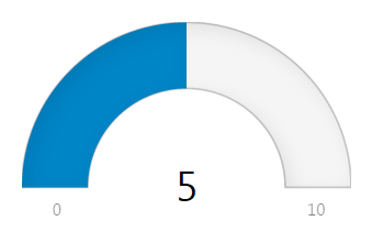
In addition to visually representing the gauge value with pointers, you can have the actual value displayed as a text label on the gauge. One simple property determines which values the gauge should display as text including the min, max, and value.
Display Colorful Ranges
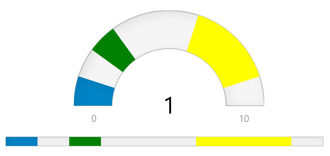
Add any number of ranges to show zones of interest. You can customize the style and size of the ranges to best suit any desired look. The gauge will determine which range contains the current gauge value and will apply that range's color to the gauge pointer.
Display Needles Bound to the Gauge Value
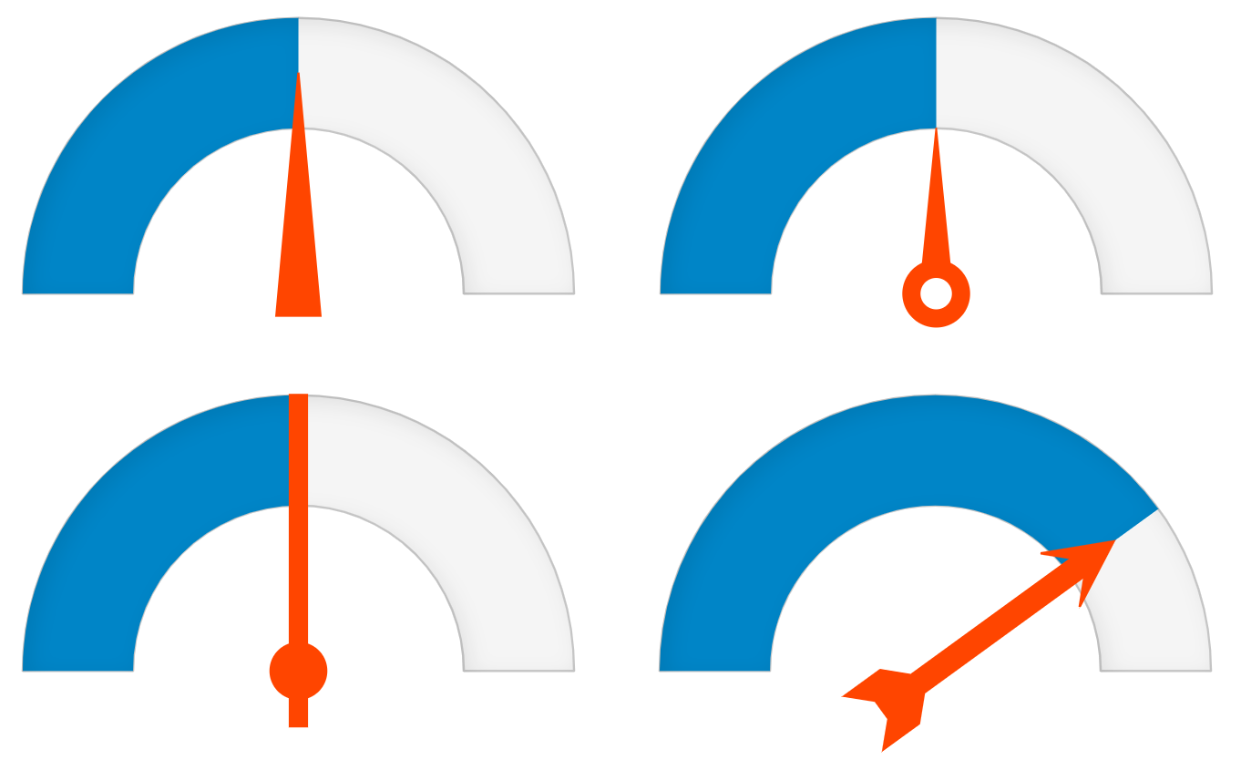
Gauge needles, or pointers, are used to indicate the gauge value and are often the alternative to the filled-bar design of most modern gauges. The ASP.NET MVC Radial Gauge control for .NET Core supports needle-based pointers with custom shapes and lengths.
Customize with Themes
The appearance of the gauges is largely defined in CSS. In addition to the default theme, you can choose from several professionally-designed themes that customize the appearance of all MVC controls to achieve a consistent, attractive look.
